|
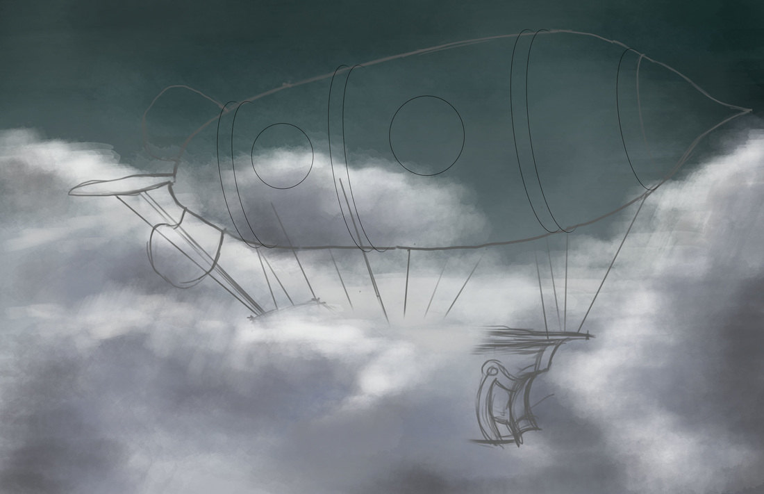
I was on an unplanned week hiatus, and only recently came up with my 30th day drawing challenge (theme: anything steampunk). I was doing some research on steampunk objects and art and initially decided to do something like an interior vignette--(Note 1: I am a lot more comfortable with doing interiors being an ID graduate and licensee) (Note 2: an interior vignette complete with steampunk-style furniture and whatnot) but decided on a totally different track. I wanted to do a steampunk airship. For some reason, I was immediately attracted to the idea because I have a little obsession with balloons and balloon art. It's my first time doing a blimp / airship concept though, so I searched immediately for references. Some references led me searching for anatomies of a ship. Since I wanted to understand the forms and shapes better, I looked through the Google Sketchup 3D Warehouse for pirate ship models. Eventually ended up downloading models based on Pirates of the Carribean ships (Dutchman, etc). As for the blimp/airship concept, the references were a whole lot. It's a popular subject in steampunk digital paintings. Plus it's pretty close to what you'd see on Final Fantasy game art (though FF art is not necessarily steampunk). I also Google-searched industrial blimps (as Steampunk is essentially inspired by 19th century technology) to simulate the design. The following sketches are what I initially came up with as studies prior to the digital painting process: 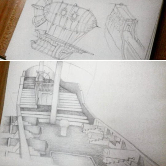 It took me a few days to finally get an idea down using Photoshop. I wanted to emulate the concept I developed from the initial sketches. I wanted a good background, so I started out with sky and clouds in a stormy/rainy setting, experimenting with different brushes such as the Soft Round and Watercolor tips. During this process, I was watching tutorial videos by Matt Kohr and Cubebrush's Marc Brunet as well. It's fun to learn as you paint so that you can definitely apply the concepts they teach as well as pick up some techniques from their process.
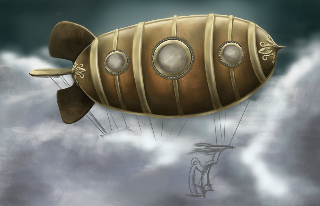
The second image is the work in progress. I spent a lot of time getting the blimp right with all the shades and textures. It was my first time creating a custom brush from a rust-like photo-realistic texture. I followed some of Marc Brunet's tips for creating brushes from textures and used them on the blimp's hulking metal form. The rusted metal effect was so cool. It's a very subtle effect but the texture does wonders for the painting. I used it with a mix of colors like rust-red and shades of brown. It was a fun process painting the details on the ship as well. The gold metallic-looking texture was initially a challenge, albeit a fun one. I had the most fun detailing the frontmost part of the blimp with an ornamental finial using reference photos. The initial plan was to paint in the mass of the ship underneath, but here I was getting carried away with the fun of detailing. It's not yet my strong suit, but... I'm pretty stoked about it. I think I'm slowly getting the hang of switching between the hard round and soft round brushes, in tandem with the eraser tool (Neat tip from Matt Kohr's video). 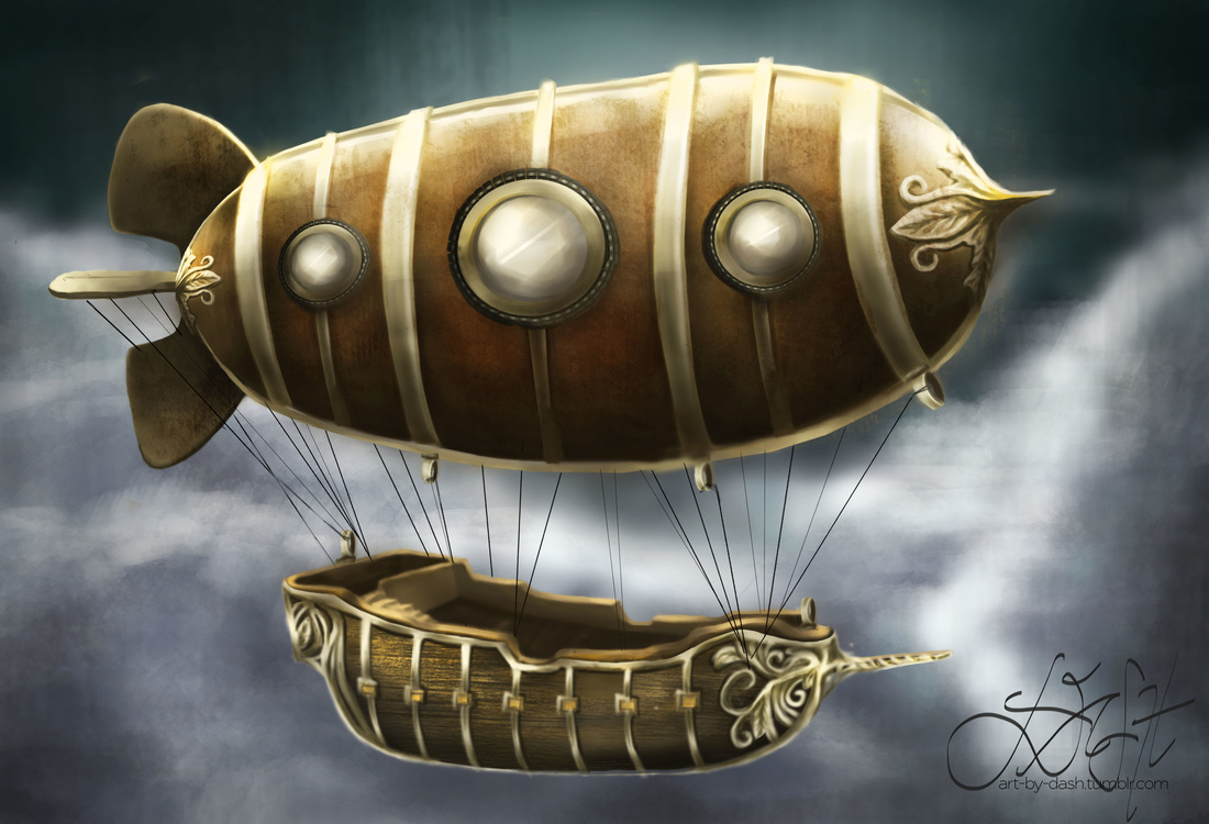 The final image has a bit of a dramatic flair. There were several changes I made during the process workflow after observing the artwork with "fresher eyes". For one thing, I figured that the blimp looked too flat and untrue to its shape. Since the form is a bit cylindrical, I adjusted the shadows following what I learned recently from Matt Kohr's videos on light and shadow. He explains that the first step in determining your shadow is to imagine a "terminator line" from where the light is hitting an object. I love how he teaches in a really scientific way (but I digress). Used a lot of dodge-and-burn tools as well to increase the overall contrast.
The ship was a lot easier to deal with, having sketched a few studies for familiarization. It was a matter of painting the basic shapes and tone values before anything else. It's a lot less detailed than the ship models I used for studies, but I'm happy with it all the same. The wood texture was simulated by custom brush (I had a lot of fun with this) and the finial/ornamentation for the gold trims were inspired by the finial I used for the blimp. In a nutshell, it took quite a few days to do this but I'm really happy that I trusted the process. The result is far better than I could ever imagine, and the final piece is pretty close to what I had in mind. Thus concludes my 30-day drawing challenge! Looking forward to more paintings and sketches in the near future!
0 Comments
This is going to be a quick entry as there are a lot of things on my plate today. Yesterday's drawing challenge was to draw a Doctor Who villain. Since I couldn't relate (I don't really watch Doctor Who) I started on another painting, still a TV series--on my favorite couple from Descendants of the Sun. The short background is, Yoon Myeung Joo (the girl) is an army surgeon while Dae Young is a sergeant major in the same army. Since Myeung Joo's dad wanted a different suitor for her, the two were always on separate missions and assigned to different areas. However, things change in DotS as Dae Young is asked by Myeung Joo's dad to quit the army if he really wanted to date her. I'll stop here since I wouldn't want to spoil the story, but they are definitely the most lovable couple. Myeung Joo normally is the personification of "if looks could kill" but the funny thing is whenever she is with Dae Young, she almost always is a tamer version of herself. This is kind of a step-by-step screenshot set of the process I followed while doing this painting.  First and Second Pass  Painting Dae Young's face  Painting Myeung Joo's face  Rendered image While doing this, I figured that I generally have a hard time nailing down facial features. It's something that I have to work on. The most challenging part was that the poses were both in side profile view, so the nose and lips shapes were the hardest to get. My final test, really, was to check if they really looked like the characters I was drawing from real life. My perception is that both have a good likeness, though I asked feedback from my mom, who said the guy's chin isn't supposed to be that long (hehe, maybe it's the illusion of his chin).
Another lesson learned is to actually pay attention to the surrounding objects. In reality, this scene was a screencap from the 16th episode (which up until yesterday I wasn't able to see yet), so when I finally saw the context and background items, I finally understood what they were. So I deviated from the original pose, a bit. Either way, I think it would help more for me to understand what I'm looking at. I had the most fun doing the hair. At a close-up view, you'd see that I made some hairline texture markings on the razor edges of his haircut, which was achieved by using a different brush than the ones I normally use (Hard Round and Soft Round). I forgot which brush I actually used though. I just like the "scrape" effect. Honestly all of this human figure drawing is good practice. I can feel that I've improved a lot in proportions and assignment of tonal values. It's good practice to really be able to critically observe a subject and learn from how people or objects appear under a natural lighting setup. In this case, the lighting came mostly from Myeung Joo's back, thus illuminating Dae Young's face more. In a nutshell, I'm enjoying human figure more and more and I do look forward to practicing human figure in my sketches. One of the best things about painting is the fact that as you're doing a painting, you are also opening yourself to learning something new besides practicing skills. In the case of the digital painting I was doing in lieu of the 30-day drawing challenge (a Dancer), my significant learning involved a unique pose. I'm not that used to sketching human figure, and if you asked me to draw one straight from my imagination, chances are I wouldn't get the proportions and forms quite right. In this case, I used a picture model with dramatic lighting. The lighting in turn determined the cast shadows, highlights, reflected and occlusion shadows. It was also good practice in rendering an image with an extreme light to extreme dark tonal value spectrum. On the first pass, I was mostly working on getting the pose and proportions down, using basic shapes to block off the major features of the dancer. Let me tell you, from the picture references alone, dancing poses are an art form. Despite the stillness of the pose, the dynamics depict so much life and grace. Plus, I enjoyed learning about the natural contours of the female body in this specific pose.  First Pass On the second pass, I refined the line work a little by making a sketchy white outline that more or less captures the blocked off pose in the first pass. I had a hard time with the limbs. Especially hands! I think I might have to practice drawing limbs.  Second Pass During the rendering phase, I started using a singular tone for the entire skin portion. I made layers for the body / skin, the face, the hair and the leotard. In the end, I painted the body/skin as well as the face using one layer. This is because I find it a lot easier for me to push and pull the brush in the directions I want in order to make a smooth rendering. Plus, blending colors is a lot easier if done on a singular layer. I got down the major tonal values before starting on the cast shadows and highlights, being the extreme tonal values in the painting. I worked on the dancer's right leg towards the arms and chest, then the face, and lastly the outstretched left leg. Had the most difficult time with the hand detail (particularly the right hand). It looked flat before I added the ridges on the fingers. Detail-wise, the left leg was the most challenging. The way the light source illuminated her thigh and calf made for some differences in tone. And her leg muscular profile was challenging under the main source of light--thus I used a variety of grays to create the light areas and shadowed areas. Another challenge I encountered as I was painting this was determining how dark the darkest shadow would be compared to the background. It would have looked weird if most of the shadowed areas were extremely dark since the reference was chiaroscuro-like. (Chiaroscuro : the treatment of light and shade in drawing and painting; an effect of contrasted light and shadow created by light falling unevenly or from a particular direction on something - Google Dictionary). In the end, it was all about making sure that there is a good balance between the shadows, highlighted areas and in between. Blending with the soft airbrush worked for the transitions between shades of gray. Also, I enjoyed using two main types of brushes for this one: the Soft Round Brush and the Medium Round Brush (both set to Pen pressure under Opacity Jitter--meaning the pressure sensitivity of the stylus would adjust to how heavily you do strokes on the tablet). The two brushes make a good combination: medium round for the harsher edges, while the soft round is your best friend for blending. Plus the eraser to remove excess paint edges. At the end of the day, I'm pretty satisfied with the result of this painting. It captured the grace and flexibility of the pose while remaining true to the natural contours of the body. I learned a lot about posing and its relationships towards the light source. In line with this, I'll probably practice human figure drawing more. This being said, I'm looking forward to my next challenge -- a fan art for Descendants of the Sun. It's this famous Korean series about a military soldier and a doctor and I'm doing this in place of the Doctor Who villain (caught me here! haha I don't really watch Doctor Who so I can't relate yet).  Rendered Image That's it, I'm officially hooked on digital sketching and painting. To the point that my mind's looking for it in random. I like the way I get lost in the midst of drawing and painting, and I love not having to look for the right brushes and/or get a change of water, while being able to get a specific textural effect with a click of the mouse. I appreciated Matt Kohr's advice on starting out with traditional and manual drawing prior to proceeding to digital painting. He's right about being able to substantially improve drawing skills before translating everything into digital media. While I'm still on the learning curve on how to create digital artworks, I appreciate how far I've come. For one thing, I didn't actually realize how much I missed drawing until I started on the 30-day challenge. Perhaps the 30 day drawing challenge was the major stepping stone. Plus, having some flexible time on my hands to seriously get into video tutorials and the like. It's important to keep the flow of inspiration coming, as I learned that it is one sure nifty way to build your own virtual mental library of concepts, ideas, etc. Another crucial thing I re-learned about drawing is critical observation. Much like in interior design, drawing and art delves into the details. It's a step by step process wherein, if you don't get the right proportions and angles of your visual representation, the details can fall flat. Achieving the right structure takes a lot of practice as well as a trained eye. I find myself subtly looking at an object or surrounding, observing the tonal value changes, the way a shadow is cast in relation to the light source, and if I would interpret it, where would I start? I was climbing up the stairs earlier only to notice how the light bounced off the shiny wood finish of the balusters, and I found myself thinking visually on how I would draw the rounded shapes while trying to remember if I knew how to render glossy objects. (Which I don't think I've touched on yet in the tutorials). Basically, I do believe that I'm learning a lot, and growing in passion for art as well. I am pretty sure the time will come when I have a great built-in virtual memory library of things I've observed and studied enough to create an artwork using minimal reference. I think that is where I'm ultimately headed, but until then, I'm enjoying the process and I'm learning to trust my instincts when it comes to art. Ending this post with my latest digital sketching venture (a walker zombie inspired by the Walking Dead. In a nutshell, I've no experience working with human anatomy and figure--must make a mental note to do study sketches of human figure--and drawing this zombie made me imagine a human skeleton with parts of his skin eaten up. Like, how deep-set the bones in the skull are made to fit the hollows of human eyeballs. This goes true for the teeth and the jaw as well. There were so many crevices and recesses involved in the detailing, and this was where most of my time went as I painted this. I wanted it to look as frighteningly authentic as possible. So yeah--there we are, my first rendered Walker Zombie.) 30 Day Challenge Day 21 is to draw a Wizard, so here I was thinking of the first wizard that would come to mind (although I did think of Harry Potter, I did want to do a "traditional looking" wizard like Dumbledore, Gandalf or Saruman). I ended up picking a reference photograph of Saruman from LOTR. This post is pretty similar to the step-by-step process I outlined yesterday, so I'll make a quick run through this. 1. Gesture Sketch:  2. Sketching the basic features:  3. Layering secondary line work:  4. Finished line work:  5. Completed rendering:  It took quite some time to get the facial features, as Christopher Lee's face is really striking. I took my time studying his face and rendering the tonal values that contributed the best results, while paying attention to the significant details. I enjoyed the most while doing the rendering portion, especially upon highlighting Saruman's hair (it became a matter of learning how to adjust brush diameter--I worked mostly with a soft round brush using opacity jitter for this). The coolest thing about doing this was that I felt like I was using mixed media--colored pencils for the finer strokes, while paint strokes and eraser tool were what I mostly used for rendering his wizard's robes and the shadows. I had a lot of fun using a neutral beige background, taking advantage of the fact that my subject is a White Wizard.
Upon studying the finished product, here are my insights: (1) I think I could study more on detail control and closer detail study, and (2) It would also help to learn about rendering skin tones (I admit that I didn't bother changing his skin tone to fit the mood of the painting). (3) I liked the overall tone value of the piece, the gradation from the shadow areas to the highlights. I found that it was good practice for being aware of different tonal values and how they contribute to the bigger picture. I'll probably do another digital painting as soon as I complete another CTRL + Paint worksheet. I have to say that I am happy with being able to seriously take up digital painting as it has been something I've wanted to do for a long time. I'm taking a quick break from digital painting and will start on doing sketchup models for some projects. Stay tuned! the processI feel like I've hit a milestone today. And it is a good feeling: being able to learn and try my hand on new skills like digital painting; and being able to apply an important principle from the book 7 Habits of highly effective people, special mention of the 7th habit: Sharpening the saw. I was watching some of Matt Kohr's tutorial videos earlier today on all sorts of topics like Gesture Drawing, Basic Rendering, and Sketching Lines. It was so easy to get absorbed watching videos that they seem to blend from one to the next without clear distinction. I find that these are the best things about watching his videos: (1) they provide you with so much insight on the approach he takes towards sketching and rendering. This is a big thing when it comes to working on digital art as he breaks down a seemingly complicated process to the very roots. His process is systematic, easy to understand and plain and simple--it works. (2) Matt makes things look incredibly easy, when the truth is--it's a lot of practice and how well you are able to synthesize everything you have learned. He creates these cool exercises that lets you practice your hand and keep improving. Basically, I see the logic and discipline that Matt is imparting through his videos and drills. For instance, applying gesture drawing. He teaches you to start out with a blue pencil/crayon and make broad strokes that indicate shape and form rather than the detailed structure of a reference image. Gesture drawing is basically movement coming from the shoulder muscles. It's loose, it's indicative, and it's very blocky. He usually does this as an initial pass to block out where components of the drawing are supposed to be. While doing my 30-day Challenge today, I took a leap of faith in drawing digitally. I've made it a point to sketch my past 30-day challenge drawings manually because practice is essentially practice, and between digital media and traditional media, it is easier to exert control and pressure on the latter. I followed Matt's process, using Gesture drawing as an initial pass as seen below (Image 1) and setting the opacity of the first layer to a lower percentage, I proceeded to the second pass by roughly sketching the form while focusing on the pose of the subject, which I found to be the challenge in this particular drawing.  Image 1: Gesture drawing pass On my third pass, I did some cleaner line work while drawing over my initial passes, refining the details as I went. Then I finally got the final line art into place and started introducing the main tonal values (jumping from shades of gray). Since I darkened my background from pure white to a lighter shade of gray, I was able to use a lighter shade of gray plus the eraser tool to create the highlights. I was creating temporary layers (as Matt calls them, "temp layers") all through out, so as to facilitate ease of making brush strokes and eraser marks without worrying about working outside the lines. I also used Matt's blending techniques (though I'll admit that somewhere along the line, the rendering became quite not as smooth as it was in the beginning). Especially the background, which was the least of my priorities (as I really was focusing on my subject). 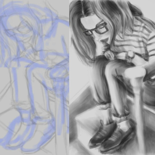 Image 2: Initial and Completed When I was satisfied with the rendering, I merged the layers and removed unnecessary lines as a bit of a clean-up step. Did some extra details on the shoes (though I was quite tempted to just darken them and get it over with) but I do like the way the shoes came out. Looking at the completed image, I'd have to say it was an enjoyable experience to practice some digital sketching and rendering. I like the loose, not-overly-detailed effect. It was a challenge using the tablet to draw for the first time as it requires some hand-to-eye coordination. It was also a challenge to be able to switch from different commands and keyboard shortcuts. Sometimes my fingers got confused between pressing the mouse, the tablet and the keyboard at different points in the process. There is definitely room for improvement, especially with the not-so-smooth rendering of the background. And maybe I should have added a jeans-like effect to the pants so as to make it look more realistic. Either way, I'm pretty grateful that I've learned a lot from Matt Kohr's tutorials and (finally!) was able to experience digital sketching. I can't wait to do another one! 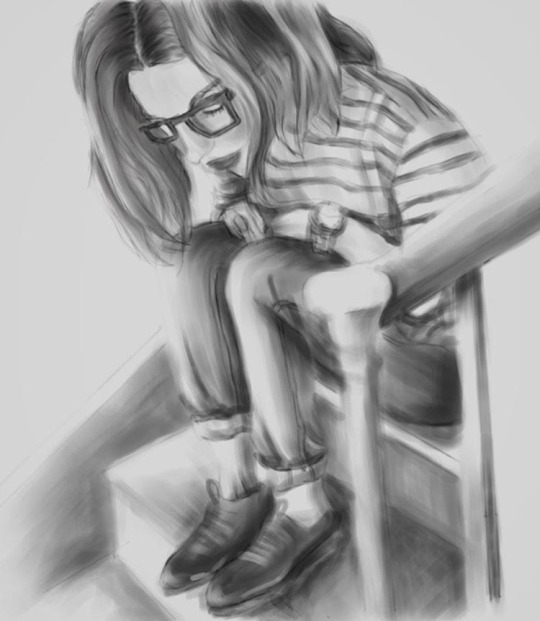 Image 3: Completed |
Nonsensical whimHi, I'm Ashley. This is my blog on journey towards discovering art and documenting my learning experiences. (Particularly Photoshop, Digital Painting, Sketchup/V-ray, Interior Design, fun tutorials I've discovered and the like). wordpress:TUMBLR:Archives
December 2018
Categories
All
|


 RSS Feed
