|
Heyo!! My first "Listopia" entry to jot down some stuff that have been on my mind this past week: 1. Inspiration - Charlie Bowater I really love this artist's work. Her name is Charlie Bowater, she's a Brit and she loves Sarah J Maas's books (the Throne of Glass series). I found out recently that she was acknowledged in Sarah J Maas's latest book Empire of Storms, and that she's been posting some fan art for the series on her IG account. Charlie Bowater's stuff is amazing. I first discovered her work while I was surfing through Youtube, stumbling on a video she did for Imagine FX (a digital art magazine). Linking below. I know it's a reaaaally long video, but it's worth the watch because you can see her painting process in real-time. She's got some amazing stuff on her Deviant Art and Instagram accounts as well. Her subjects are mostly fantasy women--she does incredible details and a lot of drama and composition go into her paintings. 2. NeonMob My friend recently told me to check out this art selling application called NeonMob, wherein people can get cards created by different artists and trade them with each other. It's not a super famous application as of yet but from the previews I've gotten once I installed the app, I am interested in becoming what they call a "creator". They've got this whole manual about posting a submission for their approval. And what really draws me to this is the fact that you can submit anything you want as long as the content is not nudity or whatever, and you can be creative about it. The idea is to be able to submit artworks like a whole series or story because the cards ideally revolve around one theme. If I ever do plan to submit I will think about my concept or theme. 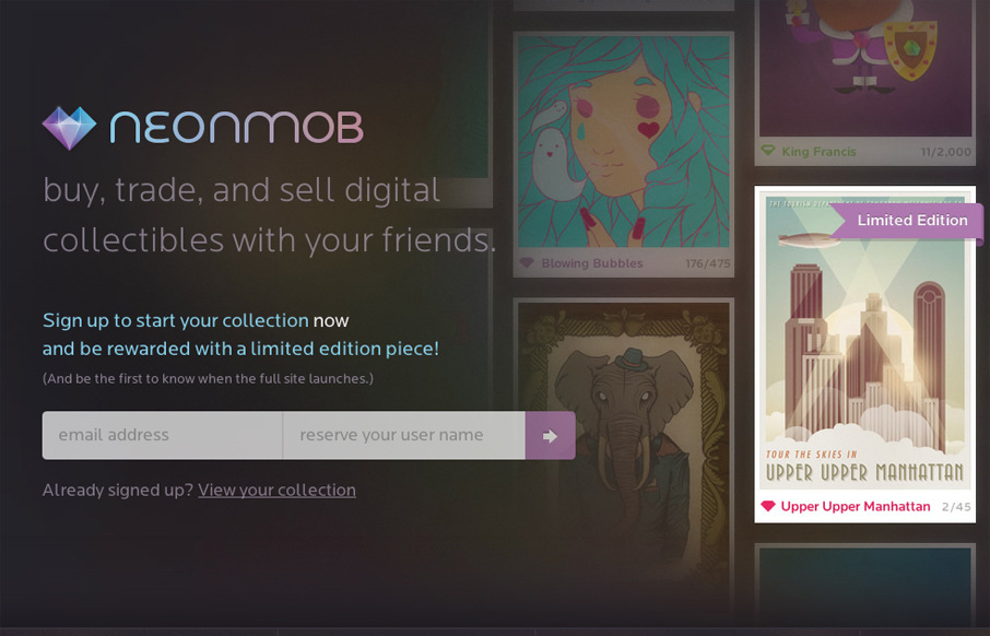 http://unmatchedstyle.com/ 3. Art Station I posted this blog before I remembered that recently I've been getting some inspiration from this website. It's a website that's similar to Deviant Art, but more straightforward. And the interface is a lot different as well. What's distinct about it is the fact that Art Station has a section for Jobs, wherein companies looking for graphic artists or conceptual designers can post job openings for hire. Also, it's a great place to showcase artworks. For one, visiting the homepage is already a pretty good look into Art Station. The latest art can be searched or filtered via the media chosen, (whether 2D or 3D), etc. You don't have to look far to find great artists actually. There are great artworks and challenges to join as well.  Credits: http://christopherfoster.azurewebsites.net/
0 Comments
This marks another milestone!Yes, it does! Because it's the first human figure drawing and painting I've done and colored digitally. Talk about awesome! I was so psyched about this one as it was a new experience not painting in black and white or gradients of grey. So as usual, I started out with the basic lines and overall composition. I used a dark background since I thought Harley's silhouette would stand out best given the offset. This drawing was pretty sketchy and meant for the basic blocking. 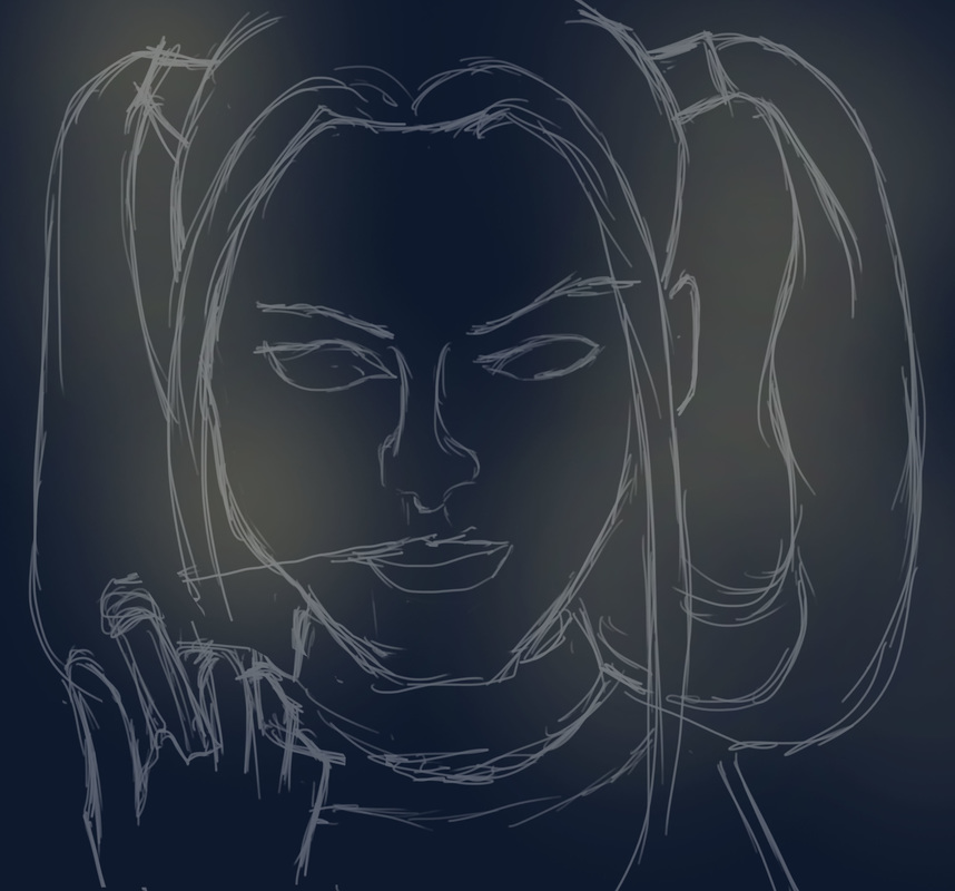 Once I had the lines sketched out, I got into the immediate focal point of the painting, being Harley's face. The main challenge was getting the facial features in a similar fashion to Margot Robbie, as Margot is stunningly pretty. I did the eyes and eyebrows first as they stood out to me the most, followed by the skin tone shading (I was so excited about this because it's my first time using colored tints and shades to mark the features and contours of the face). It wasn't as tough as I initially thought to blend the skin and tonal values of Harley's face. I just had to make sure that (1) I was using a Soft Round brush and (2) the tonal values of the areas nearest to where I was painting had to create a soft blend. I used the same technique when it came to fleshing out the details of the face, simulating Margot's smile lines and the natural glow. Forming the lips was quite a challenge, I couldn't get the right shade of red initially. And Harley's red lips, well, they stand out. The exact shade stands somewhere in between bright red, deep red orange and crimson. It was fun to render Harley's hair. Granted, there weren't just two shades of blue and red/pink. There were parts of her hair that looked like pink and blue cotton candy. And the platinum blond tint of her hair was so much fun. While shading and rendering this, a great tip I learned was subtle blending. Sometimes, to get a shade/shadow for instance, we tend to mix black or dark brown to the existing color palette. However, I realized that it is much more realistic to get the color a few steps above or below the original pigment to create a more subtle transition as well as to emphasize either highlight or shadow. Turns out drawing/painting Harley proved to be great practice for this new learning. 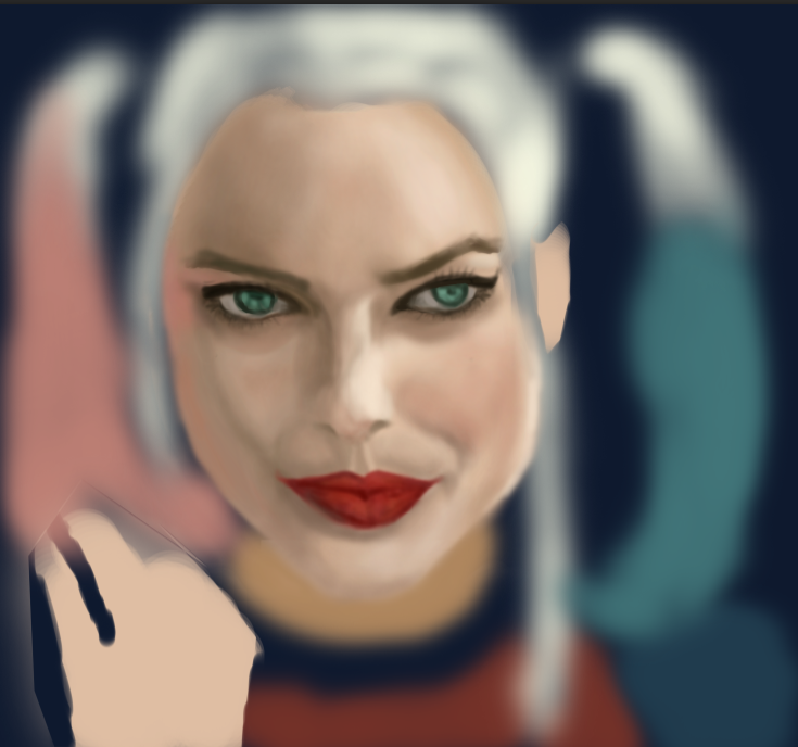 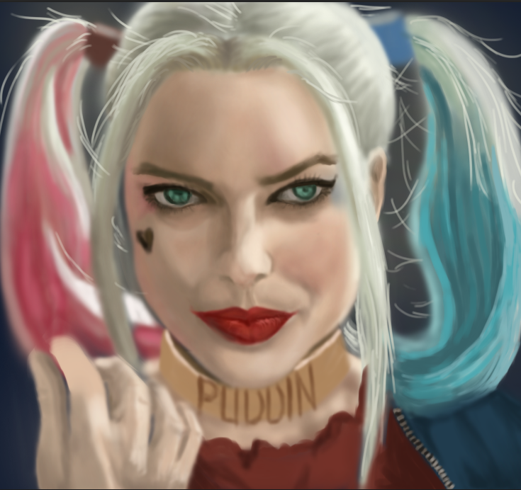 As per usual, my biggest challenge has always been the finer details and accessories. Rendering the ring and her golden neck collar were the hardest parts of the painting. I couldn't really get the word "Puddin" to look natural, so I did the best I could. It's probably the weak link in the painting. After painting in the rest of the details, I merged all of the layers and did an overall lighting levels and curves adjustment to get the best contrast and lighting. Shifting from grays to color was a pretty big transition for me. For one thing, I wasn't used to handling a variety of colors all at the same time. I was constantly worried that the shadows and highlights would look too harsh or too dark against the main colors. All in all, I was pleasantly surprised at the result of this particular painting because making the transition from greyscale to colored took some guts and trust. Trust in myself, for the most part. On any other day I might have chickened out of doing it, but now that I'm getting to where I want to be creatively, the great thing is that I'm building more trust and confidence in myself. And that's what this painting reminds me of--the fact that I chose courage and trust in pursuing my passion rather than to submit to the fear of failure. And if anything, the values I'm applying to drawing and digital painting are definitely worth it. 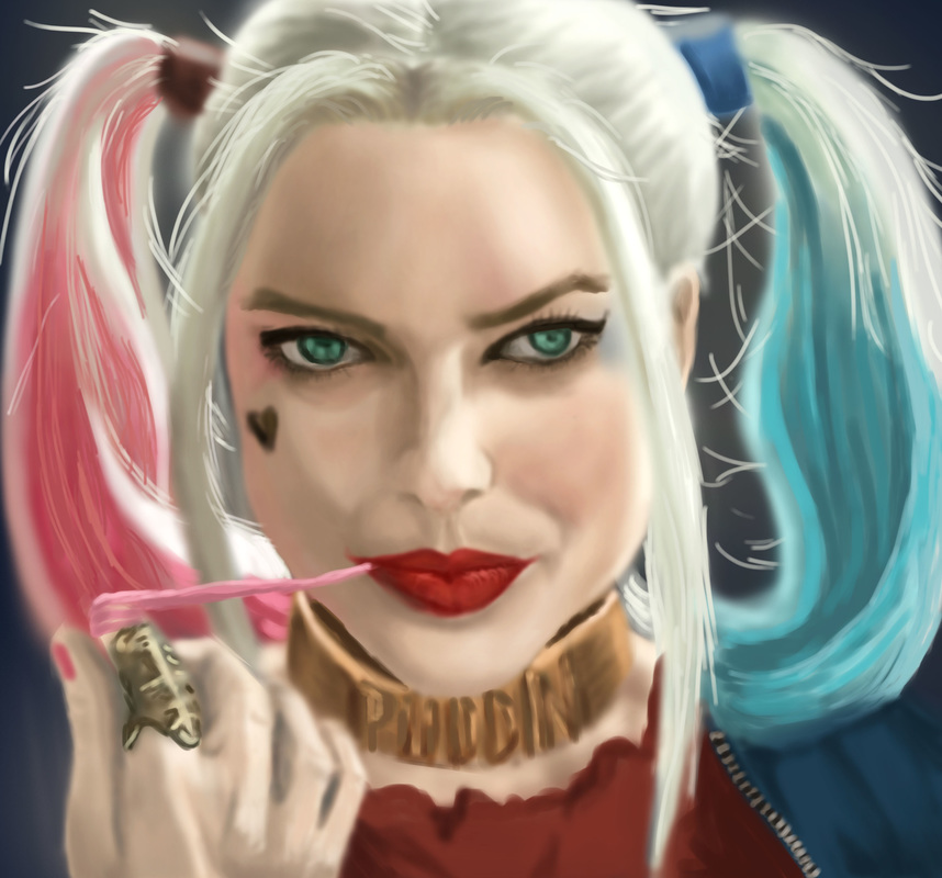 One of the best things about painting is the fact that as you're doing a painting, you are also opening yourself to learning something new besides practicing skills. In the case of the digital painting I was doing in lieu of the 30-day drawing challenge (a Dancer), my significant learning involved a unique pose. I'm not that used to sketching human figure, and if you asked me to draw one straight from my imagination, chances are I wouldn't get the proportions and forms quite right. In this case, I used a picture model with dramatic lighting. The lighting in turn determined the cast shadows, highlights, reflected and occlusion shadows. It was also good practice in rendering an image with an extreme light to extreme dark tonal value spectrum. On the first pass, I was mostly working on getting the pose and proportions down, using basic shapes to block off the major features of the dancer. Let me tell you, from the picture references alone, dancing poses are an art form. Despite the stillness of the pose, the dynamics depict so much life and grace. Plus, I enjoyed learning about the natural contours of the female body in this specific pose.  First Pass On the second pass, I refined the line work a little by making a sketchy white outline that more or less captures the blocked off pose in the first pass. I had a hard time with the limbs. Especially hands! I think I might have to practice drawing limbs.  Second Pass During the rendering phase, I started using a singular tone for the entire skin portion. I made layers for the body / skin, the face, the hair and the leotard. In the end, I painted the body/skin as well as the face using one layer. This is because I find it a lot easier for me to push and pull the brush in the directions I want in order to make a smooth rendering. Plus, blending colors is a lot easier if done on a singular layer. I got down the major tonal values before starting on the cast shadows and highlights, being the extreme tonal values in the painting. I worked on the dancer's right leg towards the arms and chest, then the face, and lastly the outstretched left leg. Had the most difficult time with the hand detail (particularly the right hand). It looked flat before I added the ridges on the fingers. Detail-wise, the left leg was the most challenging. The way the light source illuminated her thigh and calf made for some differences in tone. And her leg muscular profile was challenging under the main source of light--thus I used a variety of grays to create the light areas and shadowed areas. Another challenge I encountered as I was painting this was determining how dark the darkest shadow would be compared to the background. It would have looked weird if most of the shadowed areas were extremely dark since the reference was chiaroscuro-like. (Chiaroscuro : the treatment of light and shade in drawing and painting; an effect of contrasted light and shadow created by light falling unevenly or from a particular direction on something - Google Dictionary). In the end, it was all about making sure that there is a good balance between the shadows, highlighted areas and in between. Blending with the soft airbrush worked for the transitions between shades of gray. Also, I enjoyed using two main types of brushes for this one: the Soft Round Brush and the Medium Round Brush (both set to Pen pressure under Opacity Jitter--meaning the pressure sensitivity of the stylus would adjust to how heavily you do strokes on the tablet). The two brushes make a good combination: medium round for the harsher edges, while the soft round is your best friend for blending. Plus the eraser to remove excess paint edges. At the end of the day, I'm pretty satisfied with the result of this painting. It captured the grace and flexibility of the pose while remaining true to the natural contours of the body. I learned a lot about posing and its relationships towards the light source. In line with this, I'll probably practice human figure drawing more. This being said, I'm looking forward to my next challenge -- a fan art for Descendants of the Sun. It's this famous Korean series about a military soldier and a doctor and I'm doing this in place of the Doctor Who villain (caught me here! haha I don't really watch Doctor Who so I can't relate yet).  Rendered Image That's it, I'm officially hooked on digital sketching and painting. To the point that my mind's looking for it in random. I like the way I get lost in the midst of drawing and painting, and I love not having to look for the right brushes and/or get a change of water, while being able to get a specific textural effect with a click of the mouse. I appreciated Matt Kohr's advice on starting out with traditional and manual drawing prior to proceeding to digital painting. He's right about being able to substantially improve drawing skills before translating everything into digital media. While I'm still on the learning curve on how to create digital artworks, I appreciate how far I've come. For one thing, I didn't actually realize how much I missed drawing until I started on the 30-day challenge. Perhaps the 30 day drawing challenge was the major stepping stone. Plus, having some flexible time on my hands to seriously get into video tutorials and the like. It's important to keep the flow of inspiration coming, as I learned that it is one sure nifty way to build your own virtual mental library of concepts, ideas, etc. Another crucial thing I re-learned about drawing is critical observation. Much like in interior design, drawing and art delves into the details. It's a step by step process wherein, if you don't get the right proportions and angles of your visual representation, the details can fall flat. Achieving the right structure takes a lot of practice as well as a trained eye. I find myself subtly looking at an object or surrounding, observing the tonal value changes, the way a shadow is cast in relation to the light source, and if I would interpret it, where would I start? I was climbing up the stairs earlier only to notice how the light bounced off the shiny wood finish of the balusters, and I found myself thinking visually on how I would draw the rounded shapes while trying to remember if I knew how to render glossy objects. (Which I don't think I've touched on yet in the tutorials). Basically, I do believe that I'm learning a lot, and growing in passion for art as well. I am pretty sure the time will come when I have a great built-in virtual memory library of things I've observed and studied enough to create an artwork using minimal reference. I think that is where I'm ultimately headed, but until then, I'm enjoying the process and I'm learning to trust my instincts when it comes to art. Ending this post with my latest digital sketching venture (a walker zombie inspired by the Walking Dead. In a nutshell, I've no experience working with human anatomy and figure--must make a mental note to do study sketches of human figure--and drawing this zombie made me imagine a human skeleton with parts of his skin eaten up. Like, how deep-set the bones in the skull are made to fit the hollows of human eyeballs. This goes true for the teeth and the jaw as well. There were so many crevices and recesses involved in the detailing, and this was where most of my time went as I painted this. I wanted it to look as frighteningly authentic as possible. So yeah--there we are, my first rendered Walker Zombie.) 30 Day Challenge Day 21 is to draw a Wizard, so here I was thinking of the first wizard that would come to mind (although I did think of Harry Potter, I did want to do a "traditional looking" wizard like Dumbledore, Gandalf or Saruman). I ended up picking a reference photograph of Saruman from LOTR. This post is pretty similar to the step-by-step process I outlined yesterday, so I'll make a quick run through this. 1. Gesture Sketch:  2. Sketching the basic features:  3. Layering secondary line work:  4. Finished line work:  5. Completed rendering:  It took quite some time to get the facial features, as Christopher Lee's face is really striking. I took my time studying his face and rendering the tonal values that contributed the best results, while paying attention to the significant details. I enjoyed the most while doing the rendering portion, especially upon highlighting Saruman's hair (it became a matter of learning how to adjust brush diameter--I worked mostly with a soft round brush using opacity jitter for this). The coolest thing about doing this was that I felt like I was using mixed media--colored pencils for the finer strokes, while paint strokes and eraser tool were what I mostly used for rendering his wizard's robes and the shadows. I had a lot of fun using a neutral beige background, taking advantage of the fact that my subject is a White Wizard.
Upon studying the finished product, here are my insights: (1) I think I could study more on detail control and closer detail study, and (2) It would also help to learn about rendering skin tones (I admit that I didn't bother changing his skin tone to fit the mood of the painting). (3) I liked the overall tone value of the piece, the gradation from the shadow areas to the highlights. I found that it was good practice for being aware of different tonal values and how they contribute to the bigger picture. I'll probably do another digital painting as soon as I complete another CTRL + Paint worksheet. I have to say that I am happy with being able to seriously take up digital painting as it has been something I've wanted to do for a long time. I'm taking a quick break from digital painting and will start on doing sketchup models for some projects. Stay tuned! the processI feel like I've hit a milestone today. And it is a good feeling: being able to learn and try my hand on new skills like digital painting; and being able to apply an important principle from the book 7 Habits of highly effective people, special mention of the 7th habit: Sharpening the saw. I was watching some of Matt Kohr's tutorial videos earlier today on all sorts of topics like Gesture Drawing, Basic Rendering, and Sketching Lines. It was so easy to get absorbed watching videos that they seem to blend from one to the next without clear distinction. I find that these are the best things about watching his videos: (1) they provide you with so much insight on the approach he takes towards sketching and rendering. This is a big thing when it comes to working on digital art as he breaks down a seemingly complicated process to the very roots. His process is systematic, easy to understand and plain and simple--it works. (2) Matt makes things look incredibly easy, when the truth is--it's a lot of practice and how well you are able to synthesize everything you have learned. He creates these cool exercises that lets you practice your hand and keep improving. Basically, I see the logic and discipline that Matt is imparting through his videos and drills. For instance, applying gesture drawing. He teaches you to start out with a blue pencil/crayon and make broad strokes that indicate shape and form rather than the detailed structure of a reference image. Gesture drawing is basically movement coming from the shoulder muscles. It's loose, it's indicative, and it's very blocky. He usually does this as an initial pass to block out where components of the drawing are supposed to be. While doing my 30-day Challenge today, I took a leap of faith in drawing digitally. I've made it a point to sketch my past 30-day challenge drawings manually because practice is essentially practice, and between digital media and traditional media, it is easier to exert control and pressure on the latter. I followed Matt's process, using Gesture drawing as an initial pass as seen below (Image 1) and setting the opacity of the first layer to a lower percentage, I proceeded to the second pass by roughly sketching the form while focusing on the pose of the subject, which I found to be the challenge in this particular drawing.  Image 1: Gesture drawing pass On my third pass, I did some cleaner line work while drawing over my initial passes, refining the details as I went. Then I finally got the final line art into place and started introducing the main tonal values (jumping from shades of gray). Since I darkened my background from pure white to a lighter shade of gray, I was able to use a lighter shade of gray plus the eraser tool to create the highlights. I was creating temporary layers (as Matt calls them, "temp layers") all through out, so as to facilitate ease of making brush strokes and eraser marks without worrying about working outside the lines. I also used Matt's blending techniques (though I'll admit that somewhere along the line, the rendering became quite not as smooth as it was in the beginning). Especially the background, which was the least of my priorities (as I really was focusing on my subject). 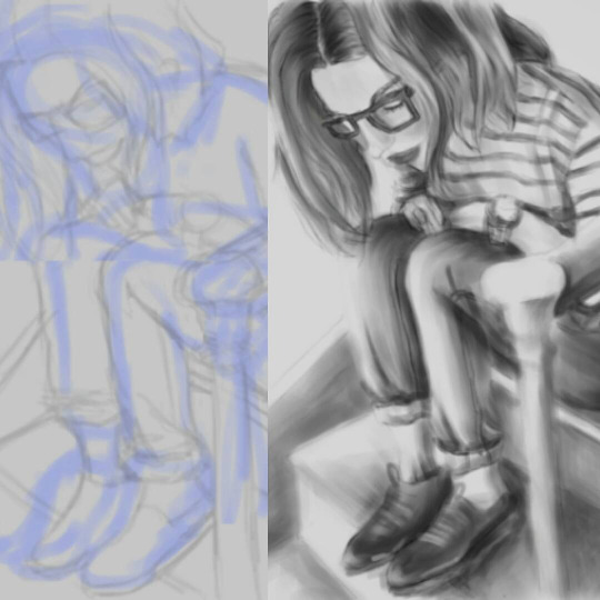 Image 2: Initial and Completed When I was satisfied with the rendering, I merged the layers and removed unnecessary lines as a bit of a clean-up step. Did some extra details on the shoes (though I was quite tempted to just darken them and get it over with) but I do like the way the shoes came out. Looking at the completed image, I'd have to say it was an enjoyable experience to practice some digital sketching and rendering. I like the loose, not-overly-detailed effect. It was a challenge using the tablet to draw for the first time as it requires some hand-to-eye coordination. It was also a challenge to be able to switch from different commands and keyboard shortcuts. Sometimes my fingers got confused between pressing the mouse, the tablet and the keyboard at different points in the process. There is definitely room for improvement, especially with the not-so-smooth rendering of the background. And maybe I should have added a jeans-like effect to the pants so as to make it look more realistic. Either way, I'm pretty grateful that I've learned a lot from Matt Kohr's tutorials and (finally!) was able to experience digital sketching. I can't wait to do another one! 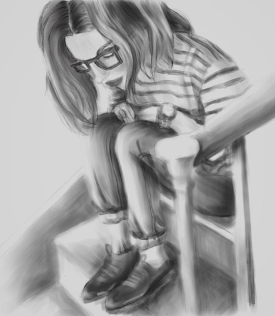 Image 3: Completed I have to say.. awesome sauce!I've been watching a few tutorials recently about the theory of clean rendering and basic brush control for digital painting on Photoshop. I particularly focused on Brush Control part 2, a video tutorial that was a simulation of the following techniques: 1. Basic Brush Control Basically getting to know how to use brushes properly. Matt teaches you some of those brush setting techniques that are different while using a tablet as against using the mouse. He also teaches how brushes can toggle opacity, flow and diameter. Going to brush settings and turning on "Transfer" > Opacity Jitter set to Pen Pressure mode. Also, setting the Flow Jitter to Pen Pressure mode. There really is a difference between using the mouse and using the Wacom stylus. 2. Edge Control Another fundamental technique: getting those sharp, clean edges that sets apart a clean and smooth rendering from a sloppy rendering. Matt teaches that an eraser tool is just like using the brush tool since you can virtually subtract excess paint edges while working on a single layer. Using "click-shift-click" technique for erasing and for adding paint really helps with the cleanliness of lines as well. It's a lot like drawing a straight line from an unusual angle. One of the most useful things I've learned so far. And frankly, I'm enjoying my first real try-out of the Wacom tablet + stylus. Matt Kohr explains it really well in this video: (click image for link)  Credits: ctrlpaint.com This next image I'm linking is Matt's tutorial on Brush Control (pt 2). He teaches you how to render this dome-shaped geometrical object by using the eyedropper tool, brush tool and eraser tool (no using masks yet, but I'll get to that in a later blog entry). (Click image for link)  Credits: ctrlpaint.com Anyway, I was able to complete the assignment he set and boy do I feel some accomplishment! The assignment was a bit more challenging than I originally thought since watching him do things makes everything actually look easy. When you're a beginner though, switching brushes and toggling the control and effects is something to master. There are so many different ways to use a single brush, and it takes a lot to really learn and practice. Then again, I'm pretty satisfied with how I completed the assignment. I will probably do another exercise soon enough. Here's the finished image:  Will accomplish more exercises soon enough. I'm pretty excited to start drawing/digital painting with the proper techniques soon!
Dude! I can't believe I'm starting out a new blog post after the years I stopped doing personal blogging. The novelty of it is actually both unnerving and fun at the same time. Nevertheless, I wanted to start out by blogging about one of the most important tutorial sites I've ever had the opportunity to learn from, and that is:  CTRL+PAINT Credits: conceptartworld.com About the siteCtrl+Paint.com is one of the best websites out there for aspiring digital (and manual) artists. Matt Kohr, the guy who owns the website, regularly uploads tutorial videos every Thursday. He uploads 4 to 5 minute videos that simulate a classroom/virtual learning environment. The lessons are brief, concise, and very straightforward. In these videos, he provides great tips, practice and homework, and the things to avoid doing. The video library I just linked is his main page--he's organized the tutorial videos into categories: (1) Traditional Drawing and Drawing Techniques (Matt explains that it's best to brush up on traditional drawing skills as this is the very foundation of learning how to paint digitally). (2) Switching to Digital Painting (3) The Advanced Digital Painting Techniques, and (4) Mental Approach towards drawing and painting. He's also got an online store selling his books on concept art, essential skills, etc. though his website and video tutorials are already very informative and newbie-friendly. THE EXPERIENCEI stumbled on his website on one of those days when I was casually surfing the Internet for artists to learn from. I'd have to say that his website is not only super informative, it is one of the best tutorial sites out there. It caters to people who are not familiar with drawing and want to learn from scratch. I just love his site because the videos he posts makes one feel extremely welcome to learn drawing, as he emphasizes that drawing is a skill to build on and can be learned by anybody who is willing to practice everyday. What I love best about learning from him is that he always gives some practical and useful advice and techniques to start out. Some of the more important techniques I learned were the use of the visual measuring tool, and methods like contouring and blocking-in shapes. He emphasizes that drawing is pretty much like learning how to visualize objects in 3D, and that it is key to every drawing to be able to master form (not shape). Contouring and linear blocking-in were both very efficient methods for me, and seeing how my approach was able to swiftly change from getting the details down to starting a drawing from the visual measuring process really made the difference. His tutorials actually gave me that confidence boost in drawing, and I truly feel the measure of improvement. Another thing I learned from him was to not be afraid of "bad drawing days". I used to hate looking at a blank canvas, not knowing where I should start and what I should do first. I'd pretty much say that his techniques have helped me a whole lot. Right now, I'm watching his videos every other day and slowly veering towards his digital painting videos (he encourages people to try out the traditional drawing video sequence before making the switch to digital tools). It makes me feel like I've been through a real art course with a really patient lecturer. He really knows his stuff, and is completely understanding of how it is to practice drawing as a beginner. Intermediate learners also stand to learn a lot from his videos--it's been like a "Back to Basics" journey for me, coming from a long drawing and art hiatus. The fact that watching his videos has encouraged me to get back into drawing has shown me that he's already made a big impact in my learning process. Openness and a thirst for knowledge to learn and re-learn techniques are what mainly guided me back from missing drawing to actually drawing again. Attaching a Ctrl + Paint video from Youtube : DIGITAL PAINTING MASTERS : INSPIRATIONAL STUFFI recently discovered some pretty amazing artists who post their painting process and speed painting videos on Youtube. Here are some of my favorites: 1. Webang111 I'm linking one of the best artists I've seen doing detailing, patterns and just overall really amazing. Her name is Akekarat Sumatchaya from Bangkok, Thailand. She uploads a lot of speed-painting art on YT, and the best thing is that she starts from scratch. Both her Youtube and Deviant art accounts are really inspiring. Gosh, what I wouldn't give to be able to watch her process in real-time! Her artworks are really beautiful, and her attention to detail is impeccable. This is one of her latest works, Silver Bird. 2. Sinix Design Oh gosh, this guy's art is AMAZING. Also discovered him via Youtube, and he's posted some really interesting video playlists. He seems to be one of those artists who are self-taught, and in digital painting, that is one amazing feat. He's one of those guys who just really has fun with digital painting. Linking one of his concept drawing videos below: 3. FZD School Feng Zhu is like, hands-down, one of the most professional artists out there. He has all sorts of posts related to concept art, digital drawing, painting, you name it. He also has podcasts about professional hurdles and experiences, and he's definitely not afraid of sharing what he has gone through to really get into what he does for a living. He's got these Design Cinema series that's spanning to almost over a hundred videos, and watching his videos more often than not gets your jaw dropping. I appreciate how he discusses his process and focuses on specific subjects at a time in his Design Cinema series. Linking one of the best ones out there: There are a lot more concept artists I look up to and admire besides the ones I've mentioned, and I'll probably link more in future blog posts. There's nothing like inspiration to get your imagination and gears kicking in. And watching these people start these paintings from a virtually blank canvas is seriously inspiring. So! The awesome news: I'm back! (I used to have a blog here with the same website address except I got sick of it).
So what's different? I'd like this blog to be about my journey towards discovering and learning new artistic ventures. I want to blog about and document my favorite artists and their works, write about new things I've discovered and/or learned, possibly post my artworks, drawings, sketches, doodles, etc. I'm pretty interested in a couple of stuff right now including V-ray and Sketchup, Digital Painting, Photoshop, Chinese Painting, Interior Design, and possibly other new things I've yet to discover. This blog is going to be all about these things and more! I can't wait to start documenting this journey. I've got two active blogs as of now as well (located in the blog sidebar), be sure to check them out too! |
Nonsensical whimHi, I'm Ashley. This is my blog on journey towards discovering art and documenting my learning experiences. (Particularly Photoshop, Digital Painting, Sketchup/V-ray, Interior Design, fun tutorials I've discovered and the like). wordpress:TUMBLR:Archives
December 2018
Categories
All
|


 RSS Feed
