|
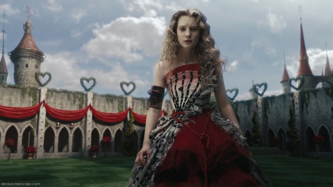
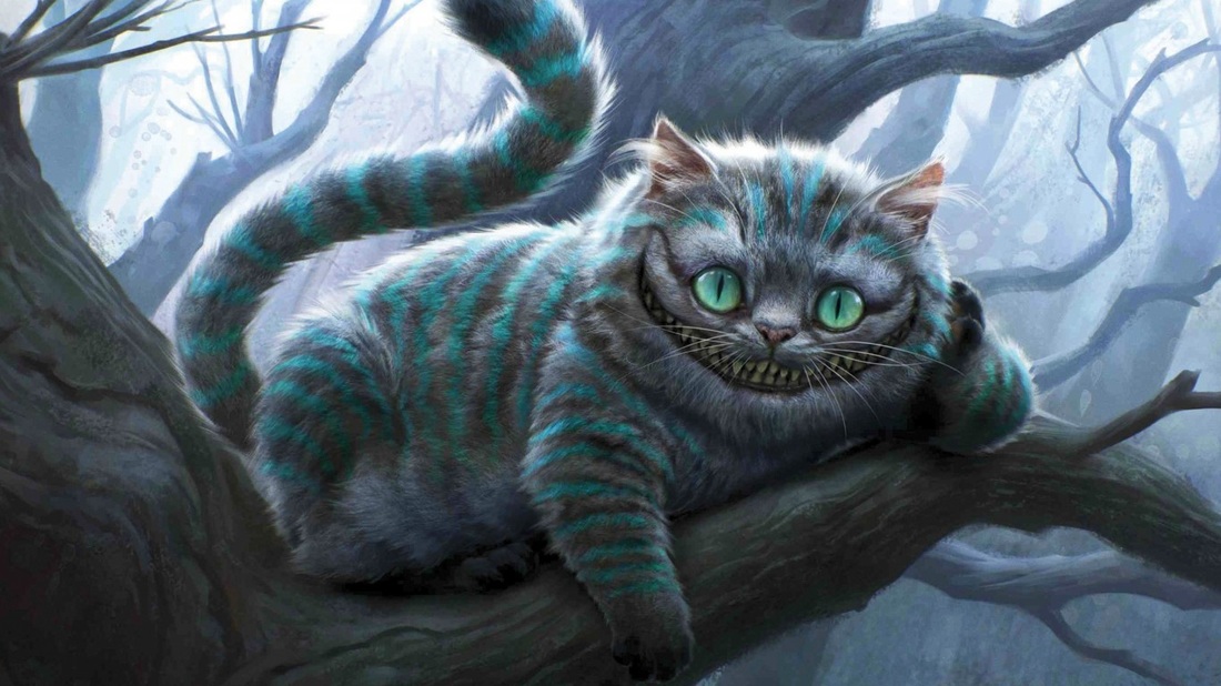
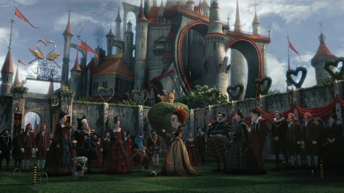
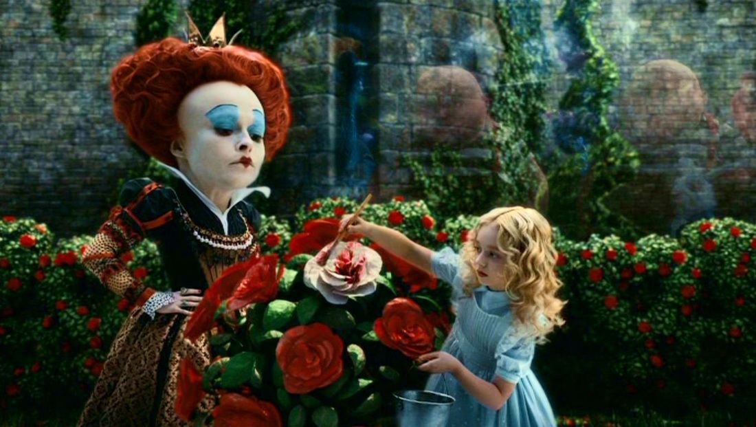
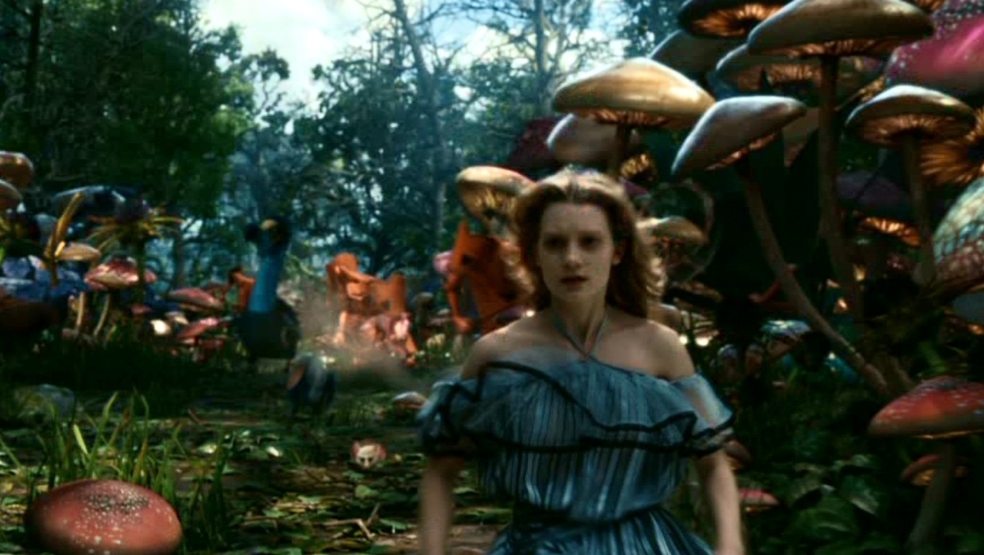
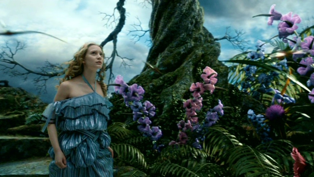
I'm really excited because a sudden thought or inspiration occurred to me. To be technically correct though, I'm harnessing an aspiration based on an idea I had sometime ago. I want to make a fairytale illustration. Something like fan art for fairytales, but in my own interpretation and style. Here's the add-on: this is still a pretty open idea, but I really want to create art for Alice in Wonderland by Lewis Carroll. It's been a timeless, adapted tale throughout the years and the reason why it's so inspiring is the fact that it's been taken apart and recreated so many times over. My favorite interpretation to date is Tim Burton's version (I have always been a Tim Burton fan!) I love his attention to detail plus the dark, whimsical setting he effortlessly brings to life through his films. It's almost always creepy and disturbing, but the darkness has a beauty and an art to it. It is one of the most imaginative interpretations of Alice to date. I'm including some screenshots for inspiration and reference here: (disclaimer: I do not own these photos. Credits to Walt Disney / Tim Burton Productions): Perhaps this will be my next concept exploration after finishing the paintings for my NeonMob series. Speaking of which, I do plan on writing a blog post after I finish up my series in order to sum up and detail my insights during and after the project. I'm really excited! I'm nearly through with the paintings and hope to be able to post them within the month of December, probably just in time for Christmas! :)
0 Comments
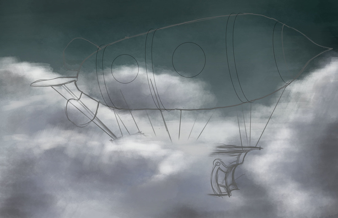
I was on an unplanned week hiatus, and only recently came up with my 30th day drawing challenge (theme: anything steampunk). I was doing some research on steampunk objects and art and initially decided to do something like an interior vignette--(Note 1: I am a lot more comfortable with doing interiors being an ID graduate and licensee) (Note 2: an interior vignette complete with steampunk-style furniture and whatnot) but decided on a totally different track. I wanted to do a steampunk airship. For some reason, I was immediately attracted to the idea because I have a little obsession with balloons and balloon art. It's my first time doing a blimp / airship concept though, so I searched immediately for references. Some references led me searching for anatomies of a ship. Since I wanted to understand the forms and shapes better, I looked through the Google Sketchup 3D Warehouse for pirate ship models. Eventually ended up downloading models based on Pirates of the Carribean ships (Dutchman, etc). As for the blimp/airship concept, the references were a whole lot. It's a popular subject in steampunk digital paintings. Plus it's pretty close to what you'd see on Final Fantasy game art (though FF art is not necessarily steampunk). I also Google-searched industrial blimps (as Steampunk is essentially inspired by 19th century technology) to simulate the design. The following sketches are what I initially came up with as studies prior to the digital painting process: 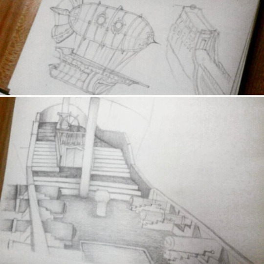 It took me a few days to finally get an idea down using Photoshop. I wanted to emulate the concept I developed from the initial sketches. I wanted a good background, so I started out with sky and clouds in a stormy/rainy setting, experimenting with different brushes such as the Soft Round and Watercolor tips. During this process, I was watching tutorial videos by Matt Kohr and Cubebrush's Marc Brunet as well. It's fun to learn as you paint so that you can definitely apply the concepts they teach as well as pick up some techniques from their process.
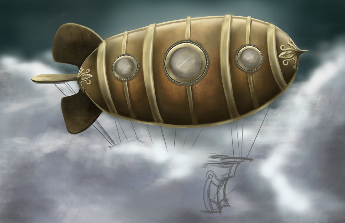
The second image is the work in progress. I spent a lot of time getting the blimp right with all the shades and textures. It was my first time creating a custom brush from a rust-like photo-realistic texture. I followed some of Marc Brunet's tips for creating brushes from textures and used them on the blimp's hulking metal form. The rusted metal effect was so cool. It's a very subtle effect but the texture does wonders for the painting. I used it with a mix of colors like rust-red and shades of brown. It was a fun process painting the details on the ship as well. The gold metallic-looking texture was initially a challenge, albeit a fun one. I had the most fun detailing the frontmost part of the blimp with an ornamental finial using reference photos. The initial plan was to paint in the mass of the ship underneath, but here I was getting carried away with the fun of detailing. It's not yet my strong suit, but... I'm pretty stoked about it. I think I'm slowly getting the hang of switching between the hard round and soft round brushes, in tandem with the eraser tool (Neat tip from Matt Kohr's video). 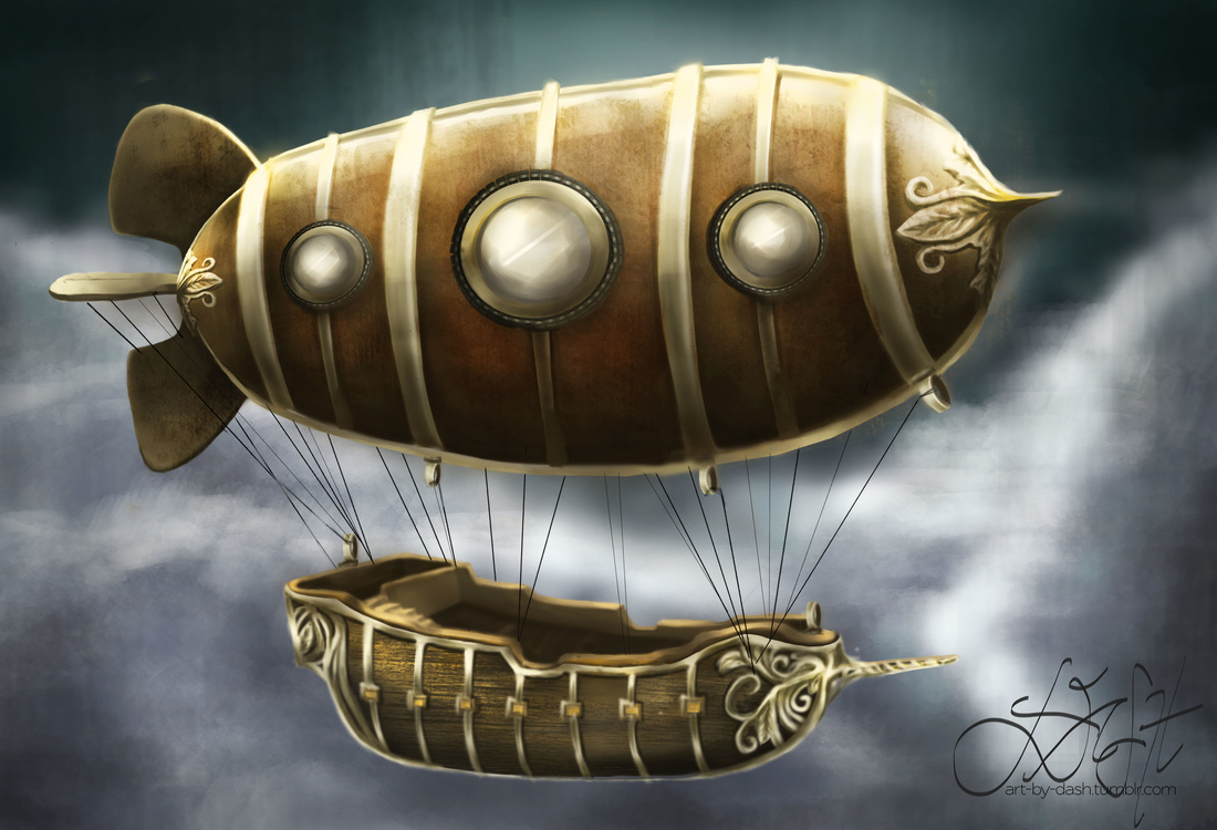 The final image has a bit of a dramatic flair. There were several changes I made during the process workflow after observing the artwork with "fresher eyes". For one thing, I figured that the blimp looked too flat and untrue to its shape. Since the form is a bit cylindrical, I adjusted the shadows following what I learned recently from Matt Kohr's videos on light and shadow. He explains that the first step in determining your shadow is to imagine a "terminator line" from where the light is hitting an object. I love how he teaches in a really scientific way (but I digress). Used a lot of dodge-and-burn tools as well to increase the overall contrast.
The ship was a lot easier to deal with, having sketched a few studies for familiarization. It was a matter of painting the basic shapes and tone values before anything else. It's a lot less detailed than the ship models I used for studies, but I'm happy with it all the same. The wood texture was simulated by custom brush (I had a lot of fun with this) and the finial/ornamentation for the gold trims were inspired by the finial I used for the blimp. In a nutshell, it took quite a few days to do this but I'm really happy that I trusted the process. The result is far better than I could ever imagine, and the final piece is pretty close to what I had in mind. Thus concludes my 30-day drawing challenge! Looking forward to more paintings and sketches in the near future! It's the first time in a long time that I tried rendering an interior space again. This is an old Arch10 plate with instructions to design a personal workspace. I was in first year when we first did this plate, and the requirements were as follows: 1. Submission / Presentation : Box Sketch Model, Concept Sheet, Schematic and Final Drawings 2. Parameters: You will be designing your own personal workspace. The space allocated to you is a 2.0m wide x 3.0m deep x 4.0m high space (clear dimensions). You can assume that each of these spaces is a uniform space allocated to individual students in a hypothetical structure built to house student workspaces. You are allowed to design the interior of the space allocated to you. It is to be used primarily for your individual work/study as an architecture/interior design student. It is not to be used for entertaining guests, holding parties or other forms of recreational activities. Since you are surrounded on both sides and on floors above and below with other workspaces, noise should be kept to a minimum. Cooking will not be allowed other than utilizing a microwave oven. There are bathrooms provided on every floor, so individual bathrooms in the workspaces are not allowed. I wrote a concept paper shortly after re-reading these instructions, and I quickly made the decision to adjust the workspace according to my needs as an interior design graduate / freelancer. There are some guide questions that came along with the parameters, such as the following: 1. What motivates you? My motivations usually arise from constant inspiration and most importantly, a passion for what I do. Passion, or doing what you love, is a value that is found innately within oneself rather than taught at school. Passion pushes one towards a willingness and drive to create and to express, creativity being one of the prime principles in this line of work. For me, getting into interior design was a fresh experience—my only background having been my previous experience of knowing how to draw. Little did I know that going into interior design would not only be about recognizing the language of line, form and function but formulating a deeper understanding of people’s lifestyles and personality, and the impact that interiors create on people’s consciousness and recollection. Having had experience in the field for four years running, passion is still the prime motivation for my work. I find inspiration in books, magazines, websites and basically just about anything with a strong visualization. 2. What are your likes and dislikes? My likes in terms of a suitable and conducive workspace include the following:
Dislikes:
3. What does introspection mean and how do you think it relates to your work? Examination and observation of one’s mental and emotional processes. In relation to my work, introspection grounds me and provides me with clarity—clarity being a clear and precise direction to work. Sometimes the results of your work can become different due to a change in approach. Introspection helps one reflect on the results that arise from the belief system and attitudes employed while accomplishing work. It is always important to reflect every once in a while and contemplate how excellent results can amount from a systematic and problem-solving approach.  Above picture shows my visualization of the space. As the space is really small but with a high ceiling, it was practical to add a mezzanine area so as to maximize the total floorspace. Here I designated the ground floor as the main work area while the mezzanine floor houses the sleeping area. For the ground floor, the first consideration in the space given is height. I established the minimum ceiling height allowable. To make the space seem airy, the presence of large windows was another main architectural consideration. The daybed space by the window is a temporary break area for reading, (like a small reading nook) and additional storage space for items. The work area features a built-in cantilevered table top with drawers and shelving. The mini-library resource adjacent to the workspace is a special haven for books and magazines to consult and read during free time or when boredom strikes. As much as I would have liked to extend the bookcase all the way to the mezzanine, it would not have been practical for height and reachability constraints. A metal finished ladder leads to the mezzanine, featuring a single bed with a wingback headboard, and a dresser which doubles as a night stand for clothes storage and such. As for architectural features, I wanted to place an architectural window extending its structural members partially adjacent to the drop ceiling. Wouldn't it be fun to have a view of the night sky studded with pinpricks of starlight as you are lying in bed? I imagine that would be an amazing experience. A glass railing acts as an added security measure, and is a good view of the focal inspiration artwork above the bookcase. The artwork unites the color scheme throughout the whole space (and purple is my favorite color no doubt about it). Both floors are finished in interlocking vinyl planks (joined by tongue-and-groove). The walls are finished in brick-simulated wallpaper / sticker for easy installation and maintenance. Anyways, that's about it, I'm pretty happy with how this turned out and most importantly, I had a lot of fun re-doing an old plate. (Trust me, the one I did in first year was horrible. No kidding. Passed with a 2.0 grade haha). I'd live in a small studio pseudo-workplace like this any day!
30 Day Challenge Day 21 is to draw a Wizard, so here I was thinking of the first wizard that would come to mind (although I did think of Harry Potter, I did want to do a "traditional looking" wizard like Dumbledore, Gandalf or Saruman). I ended up picking a reference photograph of Saruman from LOTR. This post is pretty similar to the step-by-step process I outlined yesterday, so I'll make a quick run through this. 1. Gesture Sketch:  2. Sketching the basic features:  3. Layering secondary line work:  4. Finished line work:  5. Completed rendering:  It took quite some time to get the facial features, as Christopher Lee's face is really striking. I took my time studying his face and rendering the tonal values that contributed the best results, while paying attention to the significant details. I enjoyed the most while doing the rendering portion, especially upon highlighting Saruman's hair (it became a matter of learning how to adjust brush diameter--I worked mostly with a soft round brush using opacity jitter for this). The coolest thing about doing this was that I felt like I was using mixed media--colored pencils for the finer strokes, while paint strokes and eraser tool were what I mostly used for rendering his wizard's robes and the shadows. I had a lot of fun using a neutral beige background, taking advantage of the fact that my subject is a White Wizard.
Upon studying the finished product, here are my insights: (1) I think I could study more on detail control and closer detail study, and (2) It would also help to learn about rendering skin tones (I admit that I didn't bother changing his skin tone to fit the mood of the painting). (3) I liked the overall tone value of the piece, the gradation from the shadow areas to the highlights. I found that it was good practice for being aware of different tonal values and how they contribute to the bigger picture. I'll probably do another digital painting as soon as I complete another CTRL + Paint worksheet. I have to say that I am happy with being able to seriously take up digital painting as it has been something I've wanted to do for a long time. I'm taking a quick break from digital painting and will start on doing sketchup models for some projects. Stay tuned! the processI feel like I've hit a milestone today. And it is a good feeling: being able to learn and try my hand on new skills like digital painting; and being able to apply an important principle from the book 7 Habits of highly effective people, special mention of the 7th habit: Sharpening the saw. I was watching some of Matt Kohr's tutorial videos earlier today on all sorts of topics like Gesture Drawing, Basic Rendering, and Sketching Lines. It was so easy to get absorbed watching videos that they seem to blend from one to the next without clear distinction. I find that these are the best things about watching his videos: (1) they provide you with so much insight on the approach he takes towards sketching and rendering. This is a big thing when it comes to working on digital art as he breaks down a seemingly complicated process to the very roots. His process is systematic, easy to understand and plain and simple--it works. (2) Matt makes things look incredibly easy, when the truth is--it's a lot of practice and how well you are able to synthesize everything you have learned. He creates these cool exercises that lets you practice your hand and keep improving. Basically, I see the logic and discipline that Matt is imparting through his videos and drills. For instance, applying gesture drawing. He teaches you to start out with a blue pencil/crayon and make broad strokes that indicate shape and form rather than the detailed structure of a reference image. Gesture drawing is basically movement coming from the shoulder muscles. It's loose, it's indicative, and it's very blocky. He usually does this as an initial pass to block out where components of the drawing are supposed to be. While doing my 30-day Challenge today, I took a leap of faith in drawing digitally. I've made it a point to sketch my past 30-day challenge drawings manually because practice is essentially practice, and between digital media and traditional media, it is easier to exert control and pressure on the latter. I followed Matt's process, using Gesture drawing as an initial pass as seen below (Image 1) and setting the opacity of the first layer to a lower percentage, I proceeded to the second pass by roughly sketching the form while focusing on the pose of the subject, which I found to be the challenge in this particular drawing.  Image 1: Gesture drawing pass On my third pass, I did some cleaner line work while drawing over my initial passes, refining the details as I went. Then I finally got the final line art into place and started introducing the main tonal values (jumping from shades of gray). Since I darkened my background from pure white to a lighter shade of gray, I was able to use a lighter shade of gray plus the eraser tool to create the highlights. I was creating temporary layers (as Matt calls them, "temp layers") all through out, so as to facilitate ease of making brush strokes and eraser marks without worrying about working outside the lines. I also used Matt's blending techniques (though I'll admit that somewhere along the line, the rendering became quite not as smooth as it was in the beginning). Especially the background, which was the least of my priorities (as I really was focusing on my subject). 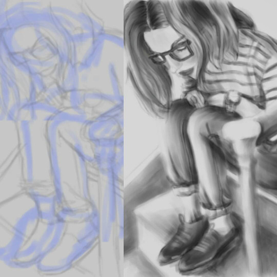 Image 2: Initial and Completed When I was satisfied with the rendering, I merged the layers and removed unnecessary lines as a bit of a clean-up step. Did some extra details on the shoes (though I was quite tempted to just darken them and get it over with) but I do like the way the shoes came out. Looking at the completed image, I'd have to say it was an enjoyable experience to practice some digital sketching and rendering. I like the loose, not-overly-detailed effect. It was a challenge using the tablet to draw for the first time as it requires some hand-to-eye coordination. It was also a challenge to be able to switch from different commands and keyboard shortcuts. Sometimes my fingers got confused between pressing the mouse, the tablet and the keyboard at different points in the process. There is definitely room for improvement, especially with the not-so-smooth rendering of the background. And maybe I should have added a jeans-like effect to the pants so as to make it look more realistic. Either way, I'm pretty grateful that I've learned a lot from Matt Kohr's tutorials and (finally!) was able to experience digital sketching. I can't wait to do another one! 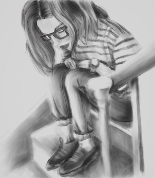 Image 3: Completed |
Nonsensical whimHi, I'm Ashley. This is my blog on journey towards discovering art and documenting my learning experiences. (Particularly Photoshop, Digital Painting, Sketchup/V-ray, Interior Design, fun tutorials I've discovered and the like). wordpress:TUMBLR:Archives
December 2018
Categories
All
|


 RSS Feed
