This marks another milestone!Yes, it does! Because it's the first human figure drawing and painting I've done and colored digitally. Talk about awesome! I was so psyched about this one as it was a new experience not painting in black and white or gradients of grey. So as usual, I started out with the basic lines and overall composition. I used a dark background since I thought Harley's silhouette would stand out best given the offset. This drawing was pretty sketchy and meant for the basic blocking. 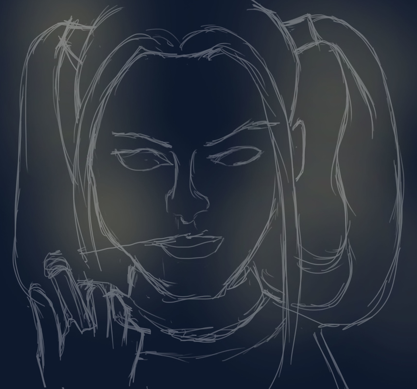 Once I had the lines sketched out, I got into the immediate focal point of the painting, being Harley's face. The main challenge was getting the facial features in a similar fashion to Margot Robbie, as Margot is stunningly pretty. I did the eyes and eyebrows first as they stood out to me the most, followed by the skin tone shading (I was so excited about this because it's my first time using colored tints and shades to mark the features and contours of the face). It wasn't as tough as I initially thought to blend the skin and tonal values of Harley's face. I just had to make sure that (1) I was using a Soft Round brush and (2) the tonal values of the areas nearest to where I was painting had to create a soft blend. I used the same technique when it came to fleshing out the details of the face, simulating Margot's smile lines and the natural glow. Forming the lips was quite a challenge, I couldn't get the right shade of red initially. And Harley's red lips, well, they stand out. The exact shade stands somewhere in between bright red, deep red orange and crimson. It was fun to render Harley's hair. Granted, there weren't just two shades of blue and red/pink. There were parts of her hair that looked like pink and blue cotton candy. And the platinum blond tint of her hair was so much fun. While shading and rendering this, a great tip I learned was subtle blending. Sometimes, to get a shade/shadow for instance, we tend to mix black or dark brown to the existing color palette. However, I realized that it is much more realistic to get the color a few steps above or below the original pigment to create a more subtle transition as well as to emphasize either highlight or shadow. Turns out drawing/painting Harley proved to be great practice for this new learning. 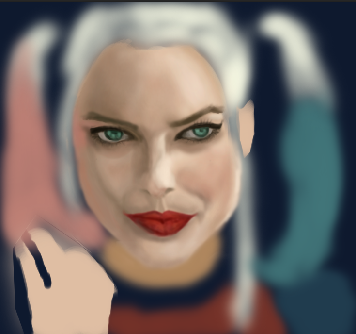 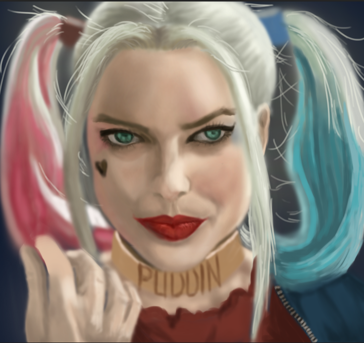 As per usual, my biggest challenge has always been the finer details and accessories. Rendering the ring and her golden neck collar were the hardest parts of the painting. I couldn't really get the word "Puddin" to look natural, so I did the best I could. It's probably the weak link in the painting. After painting in the rest of the details, I merged all of the layers and did an overall lighting levels and curves adjustment to get the best contrast and lighting. Shifting from grays to color was a pretty big transition for me. For one thing, I wasn't used to handling a variety of colors all at the same time. I was constantly worried that the shadows and highlights would look too harsh or too dark against the main colors. All in all, I was pleasantly surprised at the result of this particular painting because making the transition from greyscale to colored took some guts and trust. Trust in myself, for the most part. On any other day I might have chickened out of doing it, but now that I'm getting to where I want to be creatively, the great thing is that I'm building more trust and confidence in myself. And that's what this painting reminds me of--the fact that I chose courage and trust in pursuing my passion rather than to submit to the fear of failure. And if anything, the values I'm applying to drawing and digital painting are definitely worth it. 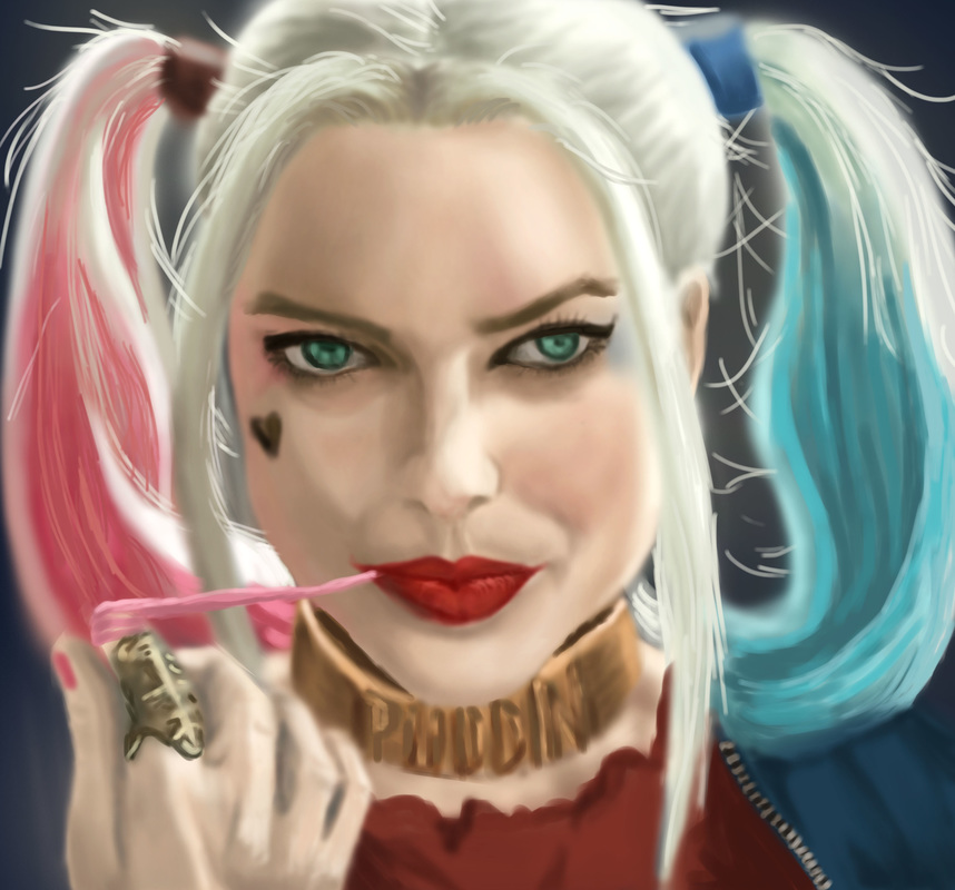
0 Comments
This is going to be a quick entry as there are a lot of things on my plate today. Yesterday's drawing challenge was to draw a Doctor Who villain. Since I couldn't relate (I don't really watch Doctor Who) I started on another painting, still a TV series--on my favorite couple from Descendants of the Sun. The short background is, Yoon Myeung Joo (the girl) is an army surgeon while Dae Young is a sergeant major in the same army. Since Myeung Joo's dad wanted a different suitor for her, the two were always on separate missions and assigned to different areas. However, things change in DotS as Dae Young is asked by Myeung Joo's dad to quit the army if he really wanted to date her. I'll stop here since I wouldn't want to spoil the story, but they are definitely the most lovable couple. Myeung Joo normally is the personification of "if looks could kill" but the funny thing is whenever she is with Dae Young, she almost always is a tamer version of herself. This is kind of a step-by-step screenshot set of the process I followed while doing this painting.  First and Second Pass  Painting Dae Young's face  Painting Myeung Joo's face  Rendered image While doing this, I figured that I generally have a hard time nailing down facial features. It's something that I have to work on. The most challenging part was that the poses were both in side profile view, so the nose and lips shapes were the hardest to get. My final test, really, was to check if they really looked like the characters I was drawing from real life. My perception is that both have a good likeness, though I asked feedback from my mom, who said the guy's chin isn't supposed to be that long (hehe, maybe it's the illusion of his chin).
Another lesson learned is to actually pay attention to the surrounding objects. In reality, this scene was a screencap from the 16th episode (which up until yesterday I wasn't able to see yet), so when I finally saw the context and background items, I finally understood what they were. So I deviated from the original pose, a bit. Either way, I think it would help more for me to understand what I'm looking at. I had the most fun doing the hair. At a close-up view, you'd see that I made some hairline texture markings on the razor edges of his haircut, which was achieved by using a different brush than the ones I normally use (Hard Round and Soft Round). I forgot which brush I actually used though. I just like the "scrape" effect. Honestly all of this human figure drawing is good practice. I can feel that I've improved a lot in proportions and assignment of tonal values. It's good practice to really be able to critically observe a subject and learn from how people or objects appear under a natural lighting setup. In this case, the lighting came mostly from Myeung Joo's back, thus illuminating Dae Young's face more. In a nutshell, I'm enjoying human figure more and more and I do look forward to practicing human figure in my sketches. That's it, I'm officially hooked on digital sketching and painting. To the point that my mind's looking for it in random. I like the way I get lost in the midst of drawing and painting, and I love not having to look for the right brushes and/or get a change of water, while being able to get a specific textural effect with a click of the mouse. I appreciated Matt Kohr's advice on starting out with traditional and manual drawing prior to proceeding to digital painting. He's right about being able to substantially improve drawing skills before translating everything into digital media. While I'm still on the learning curve on how to create digital artworks, I appreciate how far I've come. For one thing, I didn't actually realize how much I missed drawing until I started on the 30-day challenge. Perhaps the 30 day drawing challenge was the major stepping stone. Plus, having some flexible time on my hands to seriously get into video tutorials and the like. It's important to keep the flow of inspiration coming, as I learned that it is one sure nifty way to build your own virtual mental library of concepts, ideas, etc. Another crucial thing I re-learned about drawing is critical observation. Much like in interior design, drawing and art delves into the details. It's a step by step process wherein, if you don't get the right proportions and angles of your visual representation, the details can fall flat. Achieving the right structure takes a lot of practice as well as a trained eye. I find myself subtly looking at an object or surrounding, observing the tonal value changes, the way a shadow is cast in relation to the light source, and if I would interpret it, where would I start? I was climbing up the stairs earlier only to notice how the light bounced off the shiny wood finish of the balusters, and I found myself thinking visually on how I would draw the rounded shapes while trying to remember if I knew how to render glossy objects. (Which I don't think I've touched on yet in the tutorials). Basically, I do believe that I'm learning a lot, and growing in passion for art as well. I am pretty sure the time will come when I have a great built-in virtual memory library of things I've observed and studied enough to create an artwork using minimal reference. I think that is where I'm ultimately headed, but until then, I'm enjoying the process and I'm learning to trust my instincts when it comes to art. Ending this post with my latest digital sketching venture (a walker zombie inspired by the Walking Dead. In a nutshell, I've no experience working with human anatomy and figure--must make a mental note to do study sketches of human figure--and drawing this zombie made me imagine a human skeleton with parts of his skin eaten up. Like, how deep-set the bones in the skull are made to fit the hollows of human eyeballs. This goes true for the teeth and the jaw as well. There were so many crevices and recesses involved in the detailing, and this was where most of my time went as I painted this. I wanted it to look as frighteningly authentic as possible. So yeah--there we are, my first rendered Walker Zombie.) 30 Day Challenge Day 21 is to draw a Wizard, so here I was thinking of the first wizard that would come to mind (although I did think of Harry Potter, I did want to do a "traditional looking" wizard like Dumbledore, Gandalf or Saruman). I ended up picking a reference photograph of Saruman from LOTR. This post is pretty similar to the step-by-step process I outlined yesterday, so I'll make a quick run through this. 1. Gesture Sketch:  2. Sketching the basic features:  3. Layering secondary line work:  4. Finished line work:  5. Completed rendering:  It took quite some time to get the facial features, as Christopher Lee's face is really striking. I took my time studying his face and rendering the tonal values that contributed the best results, while paying attention to the significant details. I enjoyed the most while doing the rendering portion, especially upon highlighting Saruman's hair (it became a matter of learning how to adjust brush diameter--I worked mostly with a soft round brush using opacity jitter for this). The coolest thing about doing this was that I felt like I was using mixed media--colored pencils for the finer strokes, while paint strokes and eraser tool were what I mostly used for rendering his wizard's robes and the shadows. I had a lot of fun using a neutral beige background, taking advantage of the fact that my subject is a White Wizard.
Upon studying the finished product, here are my insights: (1) I think I could study more on detail control and closer detail study, and (2) It would also help to learn about rendering skin tones (I admit that I didn't bother changing his skin tone to fit the mood of the painting). (3) I liked the overall tone value of the piece, the gradation from the shadow areas to the highlights. I found that it was good practice for being aware of different tonal values and how they contribute to the bigger picture. I'll probably do another digital painting as soon as I complete another CTRL + Paint worksheet. I have to say that I am happy with being able to seriously take up digital painting as it has been something I've wanted to do for a long time. I'm taking a quick break from digital painting and will start on doing sketchup models for some projects. Stay tuned! |
Nonsensical whimHi, I'm Ashley. This is my blog on journey towards discovering art and documenting my learning experiences. (Particularly Photoshop, Digital Painting, Sketchup/V-ray, Interior Design, fun tutorials I've discovered and the like). wordpress:TUMBLR:Archives
December 2018
Categories
All
|


 RSS Feed
