The dark side.I recall brief moments when the "dark side" of me would creep up on me and overwhelm me like a tidal wave of emotions. I was big on fear of rejection, afraid of being criticized, and just too scared to make a move or decision for the fear that I might do something inaccurate or against standards. Not too long ago, I proceeded down a road wherein my thoughts revolved around being so disheartened and pessimistic: "am I good enough to be doing this?" "am I really meant to be doing this? Why isn't it working for me despite me wanting everything to work out?" Later on it became, "why bother trying? Everything I do is failing anyway" and I was pretty close to teetering over the edge of giving up. We've all had those long overhauls of self-doubt. If I had to compare, self-doubt for me is like the worst poison you could ever give yourself. The worst thing is, it's self-administered. It has nothing to do with your current circumstances, wherever and whatever you may be doing. It eats away at our systems, gives us these unseen scars. And at times we don't even see what we are inflicting on ourselves. For me, it was like going down a dark tunnel--having tunnel vision as well--with no directions, no map, no flashlight, the way seemingly never-ending. There were days I cried myself to sleep at another day of discouragement. It manifested a lot in my work as well--I wasn't drawing or creating at all, I was tired as hell and stressed all the time, I was worrying over the smallest things, I stayed up some nights journalling like mad and crying buckets, and I brought my stress with me to work as an interior designer in the firm I used to work in. My work performance dragged down as well--I lost the ability to look at and analyze things with systematic, objective clarity; I was given leadership and management roles, yet I couldn't see myself setting an example. I found myself second-guessing everything around me, even my own choices and decisions. When responsibility rested on my shoulders, I found the burden difficult to bear. I lashed out at people who tried their best to help me out of the rut I dug myself in, only listening to advice without actually following through with them. Or I would overthink, overanalyze, and leave things hanging since I couldn't figure things out. Everyday I was walking on eggshells, afraid of making mistakes (because I was afraid of the costliness), and afraid most of all that people would reject me outright. There were times I thought that I was getting better, only to see myself collapse in self-doubt the next moment. I knew I was becoming erratic and neurotic with despair, but I didn't know how to help myself out of it at all. the "pause button" and everything in between.Finally, I told myself it was finally time to press the pause button in my life. I told myself that I really needed time off to soul-search and contemplate who I am, who I am becoming, who I wanted to be, and what I really wanted to do. It was difficult to cut ties with my work, having been four years into it--I was not at all ready for change. I am the sort of person who loves comfort zones, and it isn't easy for me to walk into something without being familiar with it or knowing what to do. I wanted to be a free spirit, flying uncaged, unhinged by expectations and judgment. The first stepping stone I took after deciding to soul-search was to take it easy. With society and cultural pressure present, it's difficult enough to tell yourself to take the backseat for a little while. I also decided that I was in need of a big change in perspective--one that I had to work on by making the smallest changes in my life. I started with self-affirmation and encouragement. It was probably one of the most uplifting yet initially awkward moments, ever. For one, I didn't like "complimenting" myself because I was always afraid that it would get to my head, leading to complacency. However, it did just the opposite--it gave me that essential confidence boost and dose of positive thinking day after day. For a month or so, I tried out Hal Elrod's Miracle Morning habit which I tracked down using my bullet journal. Everyday I would follow the process while reading up on John Maxwell's "The Complete 101 Collection" which got me into baby steps towards healing. This small change in routine was subtle. I had no way of knowing at first if it was actually working or not. It began changing my attitude towards everything I was going through and it made me slowly come to believe that this was my fighting chance. There were days when I felt like it was just what it was, a routine. And there were better, more uplifting days--days when I would feel encouraged to get out of the funk. It was a very gradual and subtle shift, to be very honest. After being used to negative thinking and the defeatist attitude, I felt myself slowly developing a shift towards positive affirmation. Apparently, telling oneself everyday that you are good enough and that you are powerfully positive in everything you think, do, and say only reinforces and encourages one to be the better version of oneself. I've found that the best way to stay away from self-doubt is to know and to love yourself--and more importantly, to build and forge a good relationship with yourself. It is also about realizing that if you are not happy with your life at present, focus on making different choices. Sometimes we neglect and take for granted the power of our own choices. In this case, I found out how important it was to choose to rise above self-victimization and to make a change by choosing to grow in positivity. Hitting the pause button is all about humility and gratitude: Humility in accepting everything you are and recognizing imperfection; being able to look up to others without being afraid of rejection or basing one's self-worth on others' validation and judgment; realizing that others' stories are not one's own. Gratitude in the understanding and acceptance that everything happens for a reason. Gratitude in the knowledge that getting lost also means starting down the road of finding oneself. re-discovering and igniting passion.The route towards self-love also began with the re-discovery of passion. It's all about letting go of past disappointments, fear, and rejection and seeking courage instead.
In my case, choosing courage also meant letting go of the fear of failure. And I started this by getting back to drawing through means of a 30-day drawing challenge. That's pretty much how it all started, and it became something bigger than I originally expected. I've always loved drawing, then again I used to take the drawing process for granted. I found myself first and foremost enjoying what I was doing. Doing something I loved everyday was my way of re-discovering the passion I lost. I started trusting myself and my own instincts, letting things flow naturally. There were rusty beginnings and rough starts wherein I would find myself disliking where the drawing was going, but I continued. The more I drew, the more I found myself enjoying the process. It was like holding a pencil and translating the vision in my mind's eye on paper. I eventually stumbled on one of my long-standing goals: I started digital painting. I once told my LEAP Coach that I invested in a digital tablet for drawing but never had the guts to actually start using it. After two years of disuse, I finally took the leap of faith despite not knowing if this would lead to any substantial results. The "fluidity" came unexpectedly, and I slowly felt at ease with digital painting. The first experience was a lot of fun! Plus, I did feel pride at finally being able to do what I wanted to do. It felt good, the exalting kind of good. I spent the past few months building on my newfound skills and doing study sketches, drawings, watching tutorials and videos online. The feeling was a lot like dusting my bookshelf and filling it up with more and more books (Yes, I hoard books as I love to read). I became interested in learning more and more about establishing different techniques and practices. Sooner or later I began thinking that maybe re-discovering my love for art had a higher purpose--that of being able to inspire others to pursue their own passions. And I think that is what pretty much led me to sharing a lot of my personal journey through this blog. I still do think that at this point I am learning to love myself more each day, while being able to let go of negative energy. I'm lucky and blessed to have the support of the people around me: family and friends who are both aware and unaware of how much they helped me to continually let go of my experiences on the dark side and encouraged me to live my passion. I'm happy to be a work in progress. I'm happy to note that through this discovery, I am getting to build a solid relationship with myself. And I've got lots of things to look forward to and to work on as I go, one example being to develop commitments to myself. If you've read it up to this point, I'm glad as you are also sharing in my journey. I hope and pray for good vibes and energy to come your way!
0 Comments
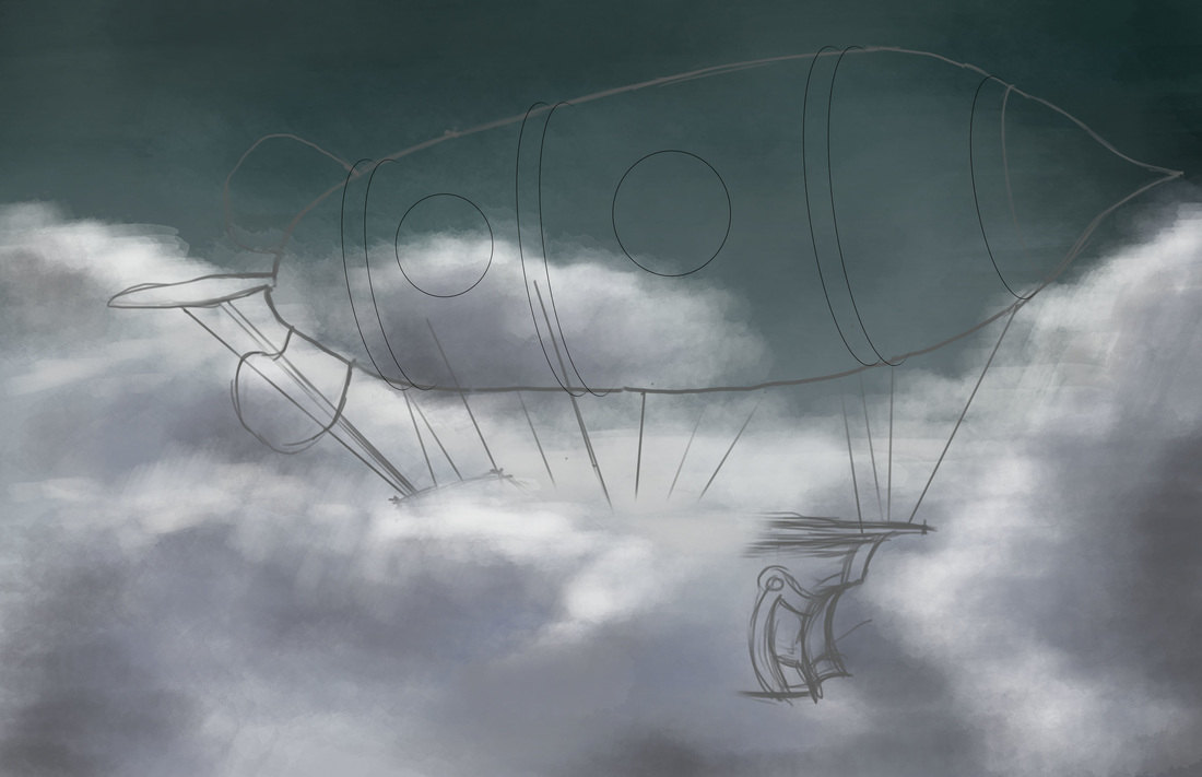
I was on an unplanned week hiatus, and only recently came up with my 30th day drawing challenge (theme: anything steampunk). I was doing some research on steampunk objects and art and initially decided to do something like an interior vignette--(Note 1: I am a lot more comfortable with doing interiors being an ID graduate and licensee) (Note 2: an interior vignette complete with steampunk-style furniture and whatnot) but decided on a totally different track. I wanted to do a steampunk airship. For some reason, I was immediately attracted to the idea because I have a little obsession with balloons and balloon art. It's my first time doing a blimp / airship concept though, so I searched immediately for references. Some references led me searching for anatomies of a ship. Since I wanted to understand the forms and shapes better, I looked through the Google Sketchup 3D Warehouse for pirate ship models. Eventually ended up downloading models based on Pirates of the Carribean ships (Dutchman, etc). As for the blimp/airship concept, the references were a whole lot. It's a popular subject in steampunk digital paintings. Plus it's pretty close to what you'd see on Final Fantasy game art (though FF art is not necessarily steampunk). I also Google-searched industrial blimps (as Steampunk is essentially inspired by 19th century technology) to simulate the design. The following sketches are what I initially came up with as studies prior to the digital painting process: 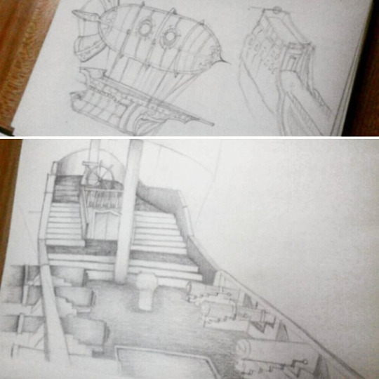 It took me a few days to finally get an idea down using Photoshop. I wanted to emulate the concept I developed from the initial sketches. I wanted a good background, so I started out with sky and clouds in a stormy/rainy setting, experimenting with different brushes such as the Soft Round and Watercolor tips. During this process, I was watching tutorial videos by Matt Kohr and Cubebrush's Marc Brunet as well. It's fun to learn as you paint so that you can definitely apply the concepts they teach as well as pick up some techniques from their process.
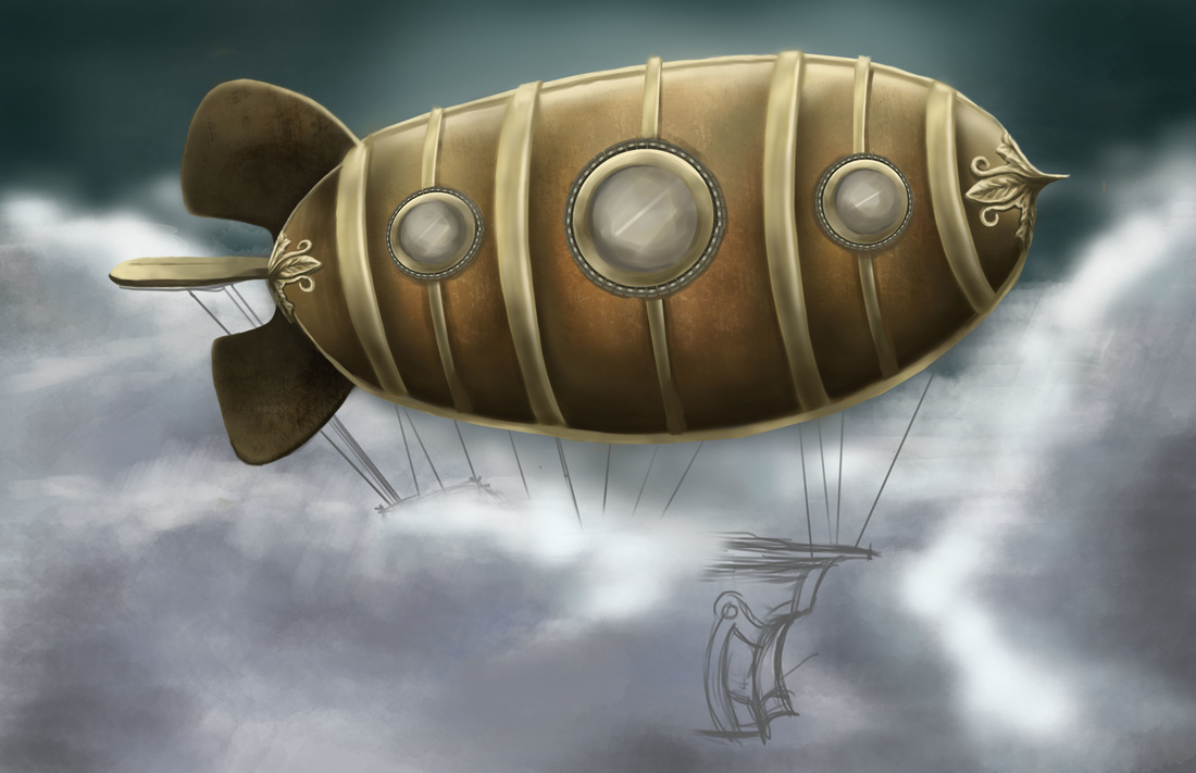
The second image is the work in progress. I spent a lot of time getting the blimp right with all the shades and textures. It was my first time creating a custom brush from a rust-like photo-realistic texture. I followed some of Marc Brunet's tips for creating brushes from textures and used them on the blimp's hulking metal form. The rusted metal effect was so cool. It's a very subtle effect but the texture does wonders for the painting. I used it with a mix of colors like rust-red and shades of brown. It was a fun process painting the details on the ship as well. The gold metallic-looking texture was initially a challenge, albeit a fun one. I had the most fun detailing the frontmost part of the blimp with an ornamental finial using reference photos. The initial plan was to paint in the mass of the ship underneath, but here I was getting carried away with the fun of detailing. It's not yet my strong suit, but... I'm pretty stoked about it. I think I'm slowly getting the hang of switching between the hard round and soft round brushes, in tandem with the eraser tool (Neat tip from Matt Kohr's video). 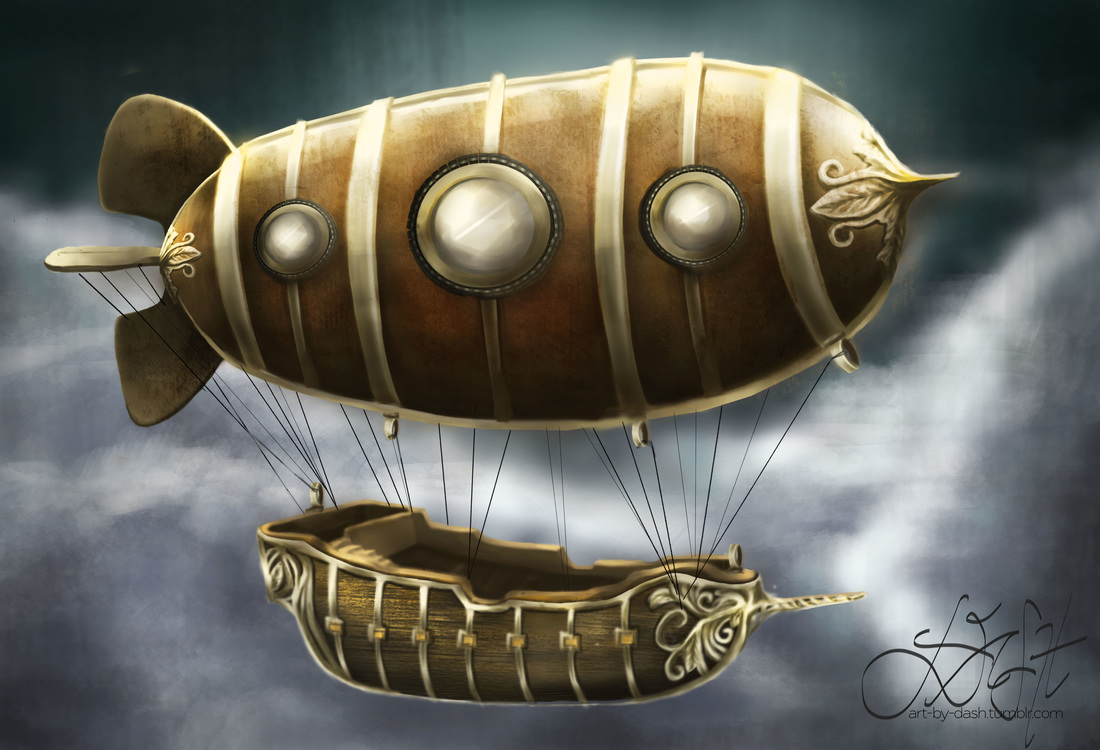 The final image has a bit of a dramatic flair. There were several changes I made during the process workflow after observing the artwork with "fresher eyes". For one thing, I figured that the blimp looked too flat and untrue to its shape. Since the form is a bit cylindrical, I adjusted the shadows following what I learned recently from Matt Kohr's videos on light and shadow. He explains that the first step in determining your shadow is to imagine a "terminator line" from where the light is hitting an object. I love how he teaches in a really scientific way (but I digress). Used a lot of dodge-and-burn tools as well to increase the overall contrast.
The ship was a lot easier to deal with, having sketched a few studies for familiarization. It was a matter of painting the basic shapes and tone values before anything else. It's a lot less detailed than the ship models I used for studies, but I'm happy with it all the same. The wood texture was simulated by custom brush (I had a lot of fun with this) and the finial/ornamentation for the gold trims were inspired by the finial I used for the blimp. In a nutshell, it took quite a few days to do this but I'm really happy that I trusted the process. The result is far better than I could ever imagine, and the final piece is pretty close to what I had in mind. Thus concludes my 30-day drawing challenge! Looking forward to more paintings and sketches in the near future! It's the first time in a long time that I tried rendering an interior space again. This is an old Arch10 plate with instructions to design a personal workspace. I was in first year when we first did this plate, and the requirements were as follows: 1. Submission / Presentation : Box Sketch Model, Concept Sheet, Schematic and Final Drawings 2. Parameters: You will be designing your own personal workspace. The space allocated to you is a 2.0m wide x 3.0m deep x 4.0m high space (clear dimensions). You can assume that each of these spaces is a uniform space allocated to individual students in a hypothetical structure built to house student workspaces. You are allowed to design the interior of the space allocated to you. It is to be used primarily for your individual work/study as an architecture/interior design student. It is not to be used for entertaining guests, holding parties or other forms of recreational activities. Since you are surrounded on both sides and on floors above and below with other workspaces, noise should be kept to a minimum. Cooking will not be allowed other than utilizing a microwave oven. There are bathrooms provided on every floor, so individual bathrooms in the workspaces are not allowed. I wrote a concept paper shortly after re-reading these instructions, and I quickly made the decision to adjust the workspace according to my needs as an interior design graduate / freelancer. There are some guide questions that came along with the parameters, such as the following: 1. What motivates you? My motivations usually arise from constant inspiration and most importantly, a passion for what I do. Passion, or doing what you love, is a value that is found innately within oneself rather than taught at school. Passion pushes one towards a willingness and drive to create and to express, creativity being one of the prime principles in this line of work. For me, getting into interior design was a fresh experience—my only background having been my previous experience of knowing how to draw. Little did I know that going into interior design would not only be about recognizing the language of line, form and function but formulating a deeper understanding of people’s lifestyles and personality, and the impact that interiors create on people’s consciousness and recollection. Having had experience in the field for four years running, passion is still the prime motivation for my work. I find inspiration in books, magazines, websites and basically just about anything with a strong visualization. 2. What are your likes and dislikes? My likes in terms of a suitable and conducive workspace include the following:
Dislikes:
3. What does introspection mean and how do you think it relates to your work? Examination and observation of one’s mental and emotional processes. In relation to my work, introspection grounds me and provides me with clarity—clarity being a clear and precise direction to work. Sometimes the results of your work can become different due to a change in approach. Introspection helps one reflect on the results that arise from the belief system and attitudes employed while accomplishing work. It is always important to reflect every once in a while and contemplate how excellent results can amount from a systematic and problem-solving approach.  Above picture shows my visualization of the space. As the space is really small but with a high ceiling, it was practical to add a mezzanine area so as to maximize the total floorspace. Here I designated the ground floor as the main work area while the mezzanine floor houses the sleeping area. For the ground floor, the first consideration in the space given is height. I established the minimum ceiling height allowable. To make the space seem airy, the presence of large windows was another main architectural consideration. The daybed space by the window is a temporary break area for reading, (like a small reading nook) and additional storage space for items. The work area features a built-in cantilevered table top with drawers and shelving. The mini-library resource adjacent to the workspace is a special haven for books and magazines to consult and read during free time or when boredom strikes. As much as I would have liked to extend the bookcase all the way to the mezzanine, it would not have been practical for height and reachability constraints. A metal finished ladder leads to the mezzanine, featuring a single bed with a wingback headboard, and a dresser which doubles as a night stand for clothes storage and such. As for architectural features, I wanted to place an architectural window extending its structural members partially adjacent to the drop ceiling. Wouldn't it be fun to have a view of the night sky studded with pinpricks of starlight as you are lying in bed? I imagine that would be an amazing experience. A glass railing acts as an added security measure, and is a good view of the focal inspiration artwork above the bookcase. The artwork unites the color scheme throughout the whole space (and purple is my favorite color no doubt about it). Both floors are finished in interlocking vinyl planks (joined by tongue-and-groove). The walls are finished in brick-simulated wallpaper / sticker for easy installation and maintenance. Anyways, that's about it, I'm pretty happy with how this turned out and most importantly, I had a lot of fun re-doing an old plate. (Trust me, the one I did in first year was horrible. No kidding. Passed with a 2.0 grade haha). I'd live in a small studio pseudo-workplace like this any day!
Heyo!! My first "Listopia" entry to jot down some stuff that have been on my mind this past week: 1. Inspiration - Charlie Bowater I really love this artist's work. Her name is Charlie Bowater, she's a Brit and she loves Sarah J Maas's books (the Throne of Glass series). I found out recently that she was acknowledged in Sarah J Maas's latest book Empire of Storms, and that she's been posting some fan art for the series on her IG account. Charlie Bowater's stuff is amazing. I first discovered her work while I was surfing through Youtube, stumbling on a video she did for Imagine FX (a digital art magazine). Linking below. I know it's a reaaaally long video, but it's worth the watch because you can see her painting process in real-time. She's got some amazing stuff on her Deviant Art and Instagram accounts as well. Her subjects are mostly fantasy women--she does incredible details and a lot of drama and composition go into her paintings. 2. NeonMob My friend recently told me to check out this art selling application called NeonMob, wherein people can get cards created by different artists and trade them with each other. It's not a super famous application as of yet but from the previews I've gotten once I installed the app, I am interested in becoming what they call a "creator". They've got this whole manual about posting a submission for their approval. And what really draws me to this is the fact that you can submit anything you want as long as the content is not nudity or whatever, and you can be creative about it. The idea is to be able to submit artworks like a whole series or story because the cards ideally revolve around one theme. If I ever do plan to submit I will think about my concept or theme.  http://unmatchedstyle.com/ 3. Art Station I posted this blog before I remembered that recently I've been getting some inspiration from this website. It's a website that's similar to Deviant Art, but more straightforward. And the interface is a lot different as well. What's distinct about it is the fact that Art Station has a section for Jobs, wherein companies looking for graphic artists or conceptual designers can post job openings for hire. Also, it's a great place to showcase artworks. For one, visiting the homepage is already a pretty good look into Art Station. The latest art can be searched or filtered via the media chosen, (whether 2D or 3D), etc. You don't have to look far to find great artists actually. There are great artworks and challenges to join as well.  Credits: http://christopherfoster.azurewebsites.net/ Oh gosh. I have a gadget craving. Even more so than the iPad Pro. I mean, I generally love Apple products, having invested in an iMac pretty recently--but my new gadget craving: Wacom Cintiq Digital Tablet. And seriously, I've been watching reviews on YT because I rarely do feel gadget cravings. Check out the specifications below: (Screenshot from wacom.com) 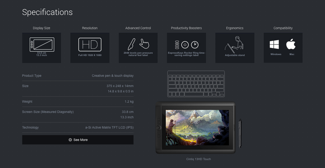 Credits: wacom.com 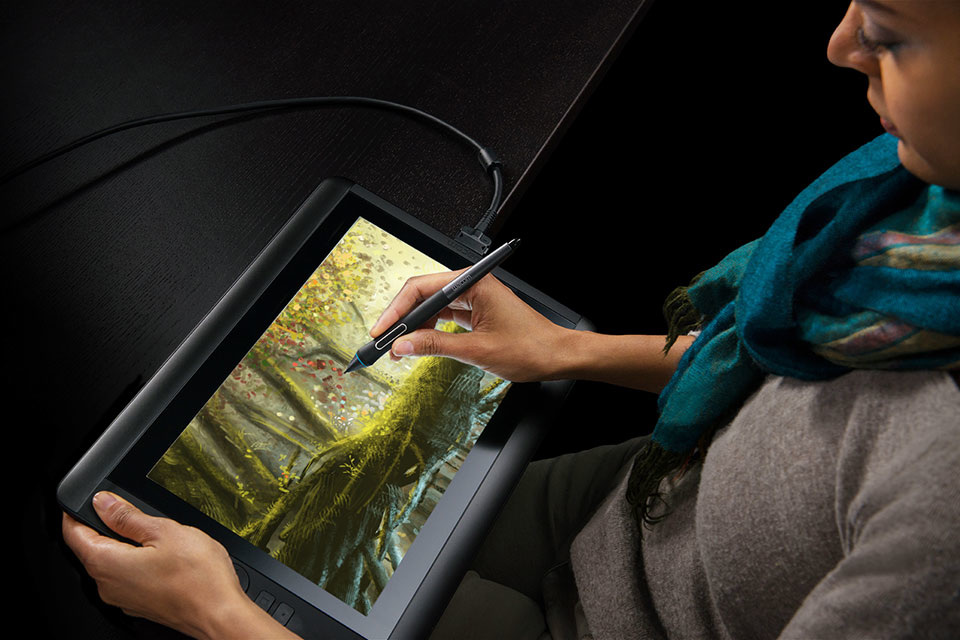 Credits: wacom.com But really, the trigger for my sudden tablet craving? I was watching W: Two Worlds, a Korean drama show about this guy called Kang Chul, a webtoon character, who is able to travel between two worlds--the real and fictional one. His love interest, Oh Yeon Joo, happens to be the daughter of the man who creates the webtoon comic Kang Chul stars in. There are a lot of scenes that show Yeon Joo's father creating digital artwork on the tablet and (I know that they don't openly advertise any brands but I could bet my ass it's a Wacom model). Anyway, I've linked some screen caps below. Images are screen-grabbed from the Korean Show W: Two Worlds, disclaiming ownership of any of the images.  W: Two Worlds, Kang Chul cover 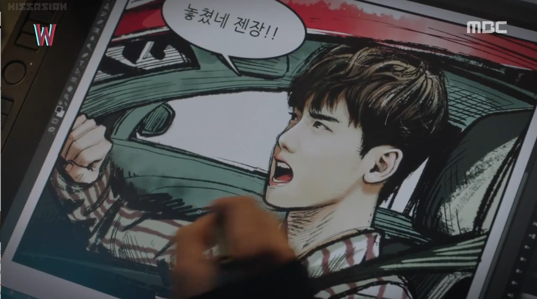 W: Two Worlds, Kang Chul art There are a lot more art inspirations on the show, though you would appreciate it better if you watch the show itself. Like, seriously, I actually love how the show includes an artsy edge to it, and the concept of the show in itself is pretty interesting. 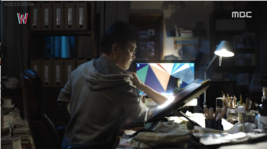 Too bad Wacom Tablets don't do this, huh? Freaky, mehn. Lastly, I'm including a short clip from FinsGraphics on Youtube. It's a very informative review on Wacom's Cintiq 13HD Pen Tablet model, and it looks every bit as awesome as it sounds. Very technical and very informative video, it really had me floored on my new gadget craving. This marks another milestone!Yes, it does! Because it's the first human figure drawing and painting I've done and colored digitally. Talk about awesome! I was so psyched about this one as it was a new experience not painting in black and white or gradients of grey. So as usual, I started out with the basic lines and overall composition. I used a dark background since I thought Harley's silhouette would stand out best given the offset. This drawing was pretty sketchy and meant for the basic blocking. 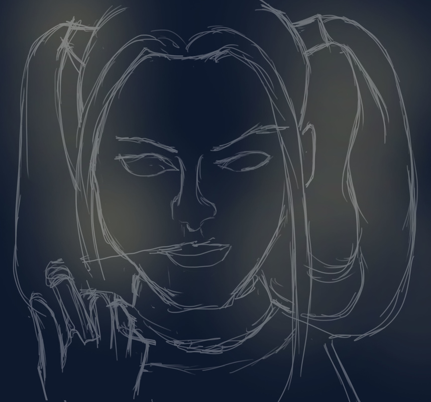 Once I had the lines sketched out, I got into the immediate focal point of the painting, being Harley's face. The main challenge was getting the facial features in a similar fashion to Margot Robbie, as Margot is stunningly pretty. I did the eyes and eyebrows first as they stood out to me the most, followed by the skin tone shading (I was so excited about this because it's my first time using colored tints and shades to mark the features and contours of the face). It wasn't as tough as I initially thought to blend the skin and tonal values of Harley's face. I just had to make sure that (1) I was using a Soft Round brush and (2) the tonal values of the areas nearest to where I was painting had to create a soft blend. I used the same technique when it came to fleshing out the details of the face, simulating Margot's smile lines and the natural glow. Forming the lips was quite a challenge, I couldn't get the right shade of red initially. And Harley's red lips, well, they stand out. The exact shade stands somewhere in between bright red, deep red orange and crimson. It was fun to render Harley's hair. Granted, there weren't just two shades of blue and red/pink. There were parts of her hair that looked like pink and blue cotton candy. And the platinum blond tint of her hair was so much fun. While shading and rendering this, a great tip I learned was subtle blending. Sometimes, to get a shade/shadow for instance, we tend to mix black or dark brown to the existing color palette. However, I realized that it is much more realistic to get the color a few steps above or below the original pigment to create a more subtle transition as well as to emphasize either highlight or shadow. Turns out drawing/painting Harley proved to be great practice for this new learning. 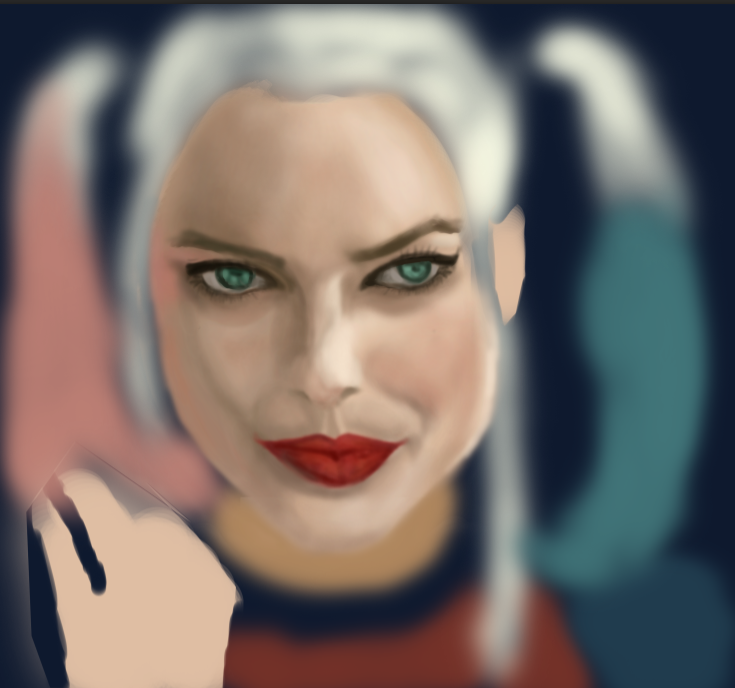 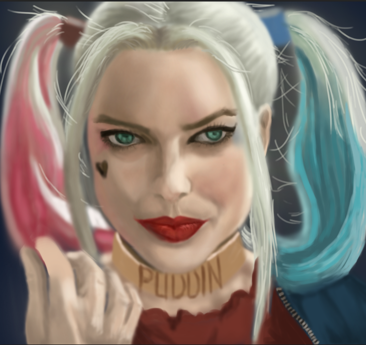 As per usual, my biggest challenge has always been the finer details and accessories. Rendering the ring and her golden neck collar were the hardest parts of the painting. I couldn't really get the word "Puddin" to look natural, so I did the best I could. It's probably the weak link in the painting. After painting in the rest of the details, I merged all of the layers and did an overall lighting levels and curves adjustment to get the best contrast and lighting. Shifting from grays to color was a pretty big transition for me. For one thing, I wasn't used to handling a variety of colors all at the same time. I was constantly worried that the shadows and highlights would look too harsh or too dark against the main colors. All in all, I was pleasantly surprised at the result of this particular painting because making the transition from greyscale to colored took some guts and trust. Trust in myself, for the most part. On any other day I might have chickened out of doing it, but now that I'm getting to where I want to be creatively, the great thing is that I'm building more trust and confidence in myself. And that's what this painting reminds me of--the fact that I chose courage and trust in pursuing my passion rather than to submit to the fear of failure. And if anything, the values I'm applying to drawing and digital painting are definitely worth it. 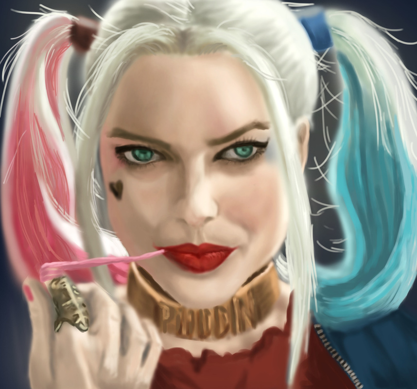 Here are some of the inspirational videos I've been viewing since last week: 1. Serafleur Serafleur (real name: Abigail Diaz) is the kind of artist you'd want to watch painting. She has a very dramatic style, and she loves painting women in different poses. I personally love her style and all her drawings are real visual treats. The colors are so vivid, the eyes are so mesmerizing, and the art is just beautiful. She calls her art semi-realistic images. I call them amazing. Her Instagram and Deviantart accounts are nothing short of amazing as well. Linking one of her digital speed painting videos as well as a button to her IG account. 2. Mirey I love Mirey's (real name: Lena) style--it's not over-polished and the art just seems so fluent. Her drawings and linework say so much about the final result. I love how her work looks like real traditional watercolor paintings despite the fact that they were done on digital media. Her artworks are mostly done in anime-esque style and like Serafleur, she mostly draws girls. I also love how she's using a different program to draw and paint (other than the usual like Photoshop and Corel). Linking one of her speed paint videos below: 3. Sketch a day : Spencer Nugent This guy seriously makes drawing look easy. I love how fluently he draws with an Apple pencil, it makes me want both the iPad Pro and Apple Pencil / actually crave for it (despite recently discovering how to use my Wacom tablet). I googled Apple pencil to see what kind of a stylus it is, and his videos came out. The one I'm linking below is the first one I watched (being the Star Wars geek). I'm inspired by his fluent and fluid drawing style. Watching his video made me want to pick up my own stylus and start drawing on the iPad too. Hands down though, the Apple Pencil has a lot of perks. You can shade using the "lead part" by turning it on its side, and control Pen Pressure sensitivity while using it on an iPad Pro. Too bad that it isn't compatible with other versions of iPad though. This is going to be a quick entry as there are a lot of things on my plate today. Yesterday's drawing challenge was to draw a Doctor Who villain. Since I couldn't relate (I don't really watch Doctor Who) I started on another painting, still a TV series--on my favorite couple from Descendants of the Sun. The short background is, Yoon Myeung Joo (the girl) is an army surgeon while Dae Young is a sergeant major in the same army. Since Myeung Joo's dad wanted a different suitor for her, the two were always on separate missions and assigned to different areas. However, things change in DotS as Dae Young is asked by Myeung Joo's dad to quit the army if he really wanted to date her. I'll stop here since I wouldn't want to spoil the story, but they are definitely the most lovable couple. Myeung Joo normally is the personification of "if looks could kill" but the funny thing is whenever she is with Dae Young, she almost always is a tamer version of herself. This is kind of a step-by-step screenshot set of the process I followed while doing this painting.  First and Second Pass  Painting Dae Young's face  Painting Myeung Joo's face  Rendered image While doing this, I figured that I generally have a hard time nailing down facial features. It's something that I have to work on. The most challenging part was that the poses were both in side profile view, so the nose and lips shapes were the hardest to get. My final test, really, was to check if they really looked like the characters I was drawing from real life. My perception is that both have a good likeness, though I asked feedback from my mom, who said the guy's chin isn't supposed to be that long (hehe, maybe it's the illusion of his chin).
Another lesson learned is to actually pay attention to the surrounding objects. In reality, this scene was a screencap from the 16th episode (which up until yesterday I wasn't able to see yet), so when I finally saw the context and background items, I finally understood what they were. So I deviated from the original pose, a bit. Either way, I think it would help more for me to understand what I'm looking at. I had the most fun doing the hair. At a close-up view, you'd see that I made some hairline texture markings on the razor edges of his haircut, which was achieved by using a different brush than the ones I normally use (Hard Round and Soft Round). I forgot which brush I actually used though. I just like the "scrape" effect. Honestly all of this human figure drawing is good practice. I can feel that I've improved a lot in proportions and assignment of tonal values. It's good practice to really be able to critically observe a subject and learn from how people or objects appear under a natural lighting setup. In this case, the lighting came mostly from Myeung Joo's back, thus illuminating Dae Young's face more. In a nutshell, I'm enjoying human figure more and more and I do look forward to practicing human figure in my sketches. One of the best things about painting is the fact that as you're doing a painting, you are also opening yourself to learning something new besides practicing skills. In the case of the digital painting I was doing in lieu of the 30-day drawing challenge (a Dancer), my significant learning involved a unique pose. I'm not that used to sketching human figure, and if you asked me to draw one straight from my imagination, chances are I wouldn't get the proportions and forms quite right. In this case, I used a picture model with dramatic lighting. The lighting in turn determined the cast shadows, highlights, reflected and occlusion shadows. It was also good practice in rendering an image with an extreme light to extreme dark tonal value spectrum. On the first pass, I was mostly working on getting the pose and proportions down, using basic shapes to block off the major features of the dancer. Let me tell you, from the picture references alone, dancing poses are an art form. Despite the stillness of the pose, the dynamics depict so much life and grace. Plus, I enjoyed learning about the natural contours of the female body in this specific pose.  First Pass On the second pass, I refined the line work a little by making a sketchy white outline that more or less captures the blocked off pose in the first pass. I had a hard time with the limbs. Especially hands! I think I might have to practice drawing limbs.  Second Pass During the rendering phase, I started using a singular tone for the entire skin portion. I made layers for the body / skin, the face, the hair and the leotard. In the end, I painted the body/skin as well as the face using one layer. This is because I find it a lot easier for me to push and pull the brush in the directions I want in order to make a smooth rendering. Plus, blending colors is a lot easier if done on a singular layer. I got down the major tonal values before starting on the cast shadows and highlights, being the extreme tonal values in the painting. I worked on the dancer's right leg towards the arms and chest, then the face, and lastly the outstretched left leg. Had the most difficult time with the hand detail (particularly the right hand). It looked flat before I added the ridges on the fingers. Detail-wise, the left leg was the most challenging. The way the light source illuminated her thigh and calf made for some differences in tone. And her leg muscular profile was challenging under the main source of light--thus I used a variety of grays to create the light areas and shadowed areas. Another challenge I encountered as I was painting this was determining how dark the darkest shadow would be compared to the background. It would have looked weird if most of the shadowed areas were extremely dark since the reference was chiaroscuro-like. (Chiaroscuro : the treatment of light and shade in drawing and painting; an effect of contrasted light and shadow created by light falling unevenly or from a particular direction on something - Google Dictionary). In the end, it was all about making sure that there is a good balance between the shadows, highlighted areas and in between. Blending with the soft airbrush worked for the transitions between shades of gray. Also, I enjoyed using two main types of brushes for this one: the Soft Round Brush and the Medium Round Brush (both set to Pen pressure under Opacity Jitter--meaning the pressure sensitivity of the stylus would adjust to how heavily you do strokes on the tablet). The two brushes make a good combination: medium round for the harsher edges, while the soft round is your best friend for blending. Plus the eraser to remove excess paint edges. At the end of the day, I'm pretty satisfied with the result of this painting. It captured the grace and flexibility of the pose while remaining true to the natural contours of the body. I learned a lot about posing and its relationships towards the light source. In line with this, I'll probably practice human figure drawing more. This being said, I'm looking forward to my next challenge -- a fan art for Descendants of the Sun. It's this famous Korean series about a military soldier and a doctor and I'm doing this in place of the Doctor Who villain (caught me here! haha I don't really watch Doctor Who so I can't relate yet).  Rendered Image That's it, I'm officially hooked on digital sketching and painting. To the point that my mind's looking for it in random. I like the way I get lost in the midst of drawing and painting, and I love not having to look for the right brushes and/or get a change of water, while being able to get a specific textural effect with a click of the mouse. I appreciated Matt Kohr's advice on starting out with traditional and manual drawing prior to proceeding to digital painting. He's right about being able to substantially improve drawing skills before translating everything into digital media. While I'm still on the learning curve on how to create digital artworks, I appreciate how far I've come. For one thing, I didn't actually realize how much I missed drawing until I started on the 30-day challenge. Perhaps the 30 day drawing challenge was the major stepping stone. Plus, having some flexible time on my hands to seriously get into video tutorials and the like. It's important to keep the flow of inspiration coming, as I learned that it is one sure nifty way to build your own virtual mental library of concepts, ideas, etc. Another crucial thing I re-learned about drawing is critical observation. Much like in interior design, drawing and art delves into the details. It's a step by step process wherein, if you don't get the right proportions and angles of your visual representation, the details can fall flat. Achieving the right structure takes a lot of practice as well as a trained eye. I find myself subtly looking at an object or surrounding, observing the tonal value changes, the way a shadow is cast in relation to the light source, and if I would interpret it, where would I start? I was climbing up the stairs earlier only to notice how the light bounced off the shiny wood finish of the balusters, and I found myself thinking visually on how I would draw the rounded shapes while trying to remember if I knew how to render glossy objects. (Which I don't think I've touched on yet in the tutorials). Basically, I do believe that I'm learning a lot, and growing in passion for art as well. I am pretty sure the time will come when I have a great built-in virtual memory library of things I've observed and studied enough to create an artwork using minimal reference. I think that is where I'm ultimately headed, but until then, I'm enjoying the process and I'm learning to trust my instincts when it comes to art. Ending this post with my latest digital sketching venture (a walker zombie inspired by the Walking Dead. In a nutshell, I've no experience working with human anatomy and figure--must make a mental note to do study sketches of human figure--and drawing this zombie made me imagine a human skeleton with parts of his skin eaten up. Like, how deep-set the bones in the skull are made to fit the hollows of human eyeballs. This goes true for the teeth and the jaw as well. There were so many crevices and recesses involved in the detailing, and this was where most of my time went as I painted this. I wanted it to look as frighteningly authentic as possible. So yeah--there we are, my first rendered Walker Zombie.) |
Nonsensical whimHi, I'm Ashley. This is my blog on journey towards discovering art and documenting my learning experiences. (Particularly Photoshop, Digital Painting, Sketchup/V-ray, Interior Design, fun tutorials I've discovered and the like). wordpress:TUMBLR:Archives
December 2018
Categories
All
|


 RSS Feed
